Pink is a cheerful, playful color that allows for many exciting color combinations. From soft blush pinks to vivid fuchsia pinks, many hues look great with different shades of pink.
In this article, we’ll explore over 45 colors that complement pink wonderfully. Discover vivid pink color palettes and schemes to use in your home decor, outfits, and designs.
Table of Contents
What is pink?
pink is a pale red color that is named after a flower of the same name. It was first used as a color name in the late 17th century.
pink is made by combining red and white. By adding more red, you get a brighter, bolder pink. Adding more white results in a softer, lighter pink.
In color theory, pink is considered a tint of red. Specifically, it falls between red and white on the color wheel. This makes it one of the lighter, softer colors.
pink is often associated with the feminine, romance, caring, tenderness, and innocence. It is thought to have a calming effect. pink is sometimes described as a combination of red’s stimulation and white’s calming effect.
The Meaning and Symbolism of pink
Throughout history, pink has been associated with femininity and romance. It continues to have these associations today.
Here are some of the common meanings and symbolism associated with the color pink:
- Romance, love, caring – Pink conveys romantic and caring feelings. It is thought to have a calming, comforting effect.
- Femininity, girlishness – Pink is strongly associated with femininity and stereotypical “girliness.” It is often chosen for girls’ toys and clothing.
- Innocence, sweetness – The soft, light pink shade evokes innocence and sweetness.
- Optimism, fun – Bright pinks suggest a playful, fun attitude. They convey energy and optimism.
- Calmness, gentleness – Soft pinks are considered calming and gentle. They create relaxing environments.
- Health, wellness – Pink’s association with caring makes it popular for health and wellness brands. It suggests compassion.
So in summary, pink spans meanings like romance, fun, femininity, innocence, and calmness. Brands leverage these symbolisms when using pink in logos, products, and marketing.
Shades of pink
There are countless shades of the color pink. Here are some of the most popular pink shades and their hex codes:
| Shade Name | Hex Code | Sample |
|---|---|---|
| Baby Pink | #F4C2C2 | |
| Baker-Miller pink | #FF91AF | |
| Blush | #DE5D83 | |
| Bright pink | #FF007F | |
| Brilliant rose | #FF55A3 | |
| Carnation pink | #FFA6C9 | |
| Cherry blossom pink | #FFB7C5 | |
| Coral pink | #F88379 | |
| Cotton candy | #FFBCD9 | |
| Deep pink | #FF1493 | |
| Dusty pink | #D58A94 | |
| Flamingo pink | #FC74FD | |
| French pink | #FD6C9E | |
| Fuchsia pink | #FF00FF | |
| Hot pink | #FF69B4 | |
| Lavender pink | #FBAED2 |
The most popular shades of pink range from soft, pale pinks like blush and baby pink to vivid hot pinks. There are pink shades with red, purple, orange, and blue undertones. The specific shade of pink conveys slightly different symbolism.
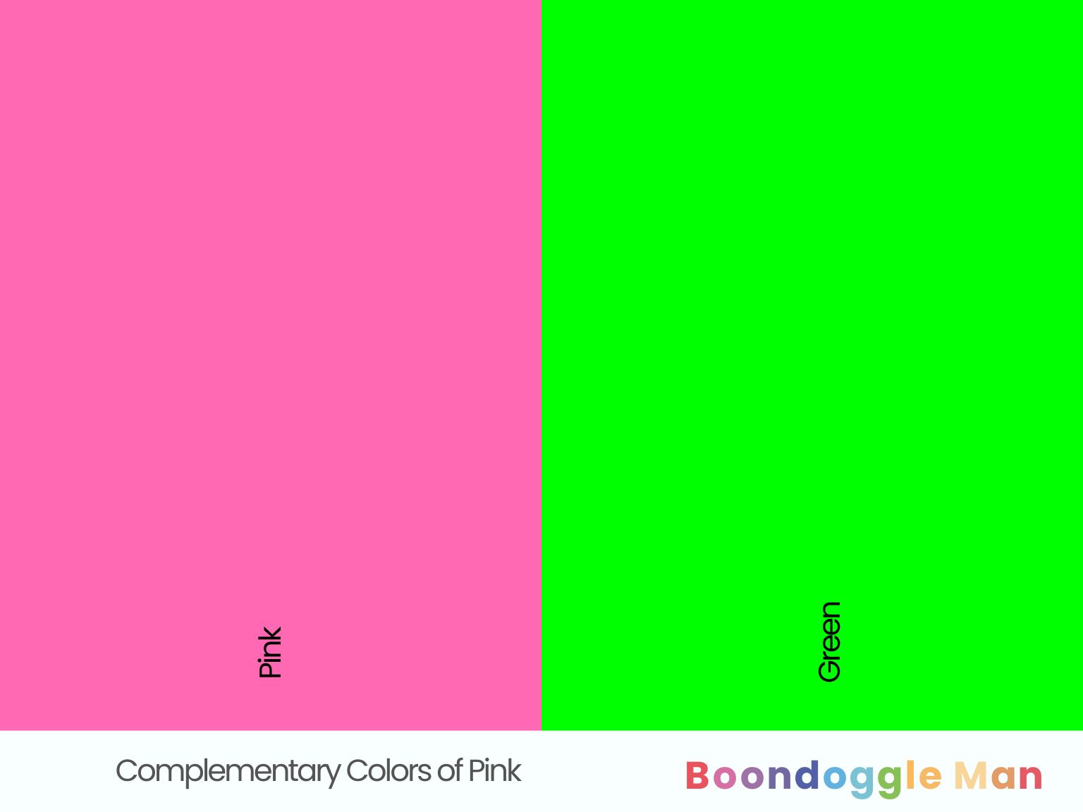
Complementary Colors of Pink
Complementary colors sit opposite each other on the color wheel, creating striking contrast. The complementary color for pink (#FFC0CB) is green (#00FF00).
Green (#00FF00)
Vibrant green balances pink’s warmth and feminity. Lime green (#32CD32), forest green (#228B22), and mint green (#98FF98) make pink pop. Seafoam green (#66B2B2) also complements pink nicely.
Incorporate green throughout pink interiors and fashion. Try a bright pink sofa with lime green and pink patterned pillows. Or pair a fuchsia skirt with a mint green top and bold emerald jewelry for contrast. Mix different shades of green and pink.
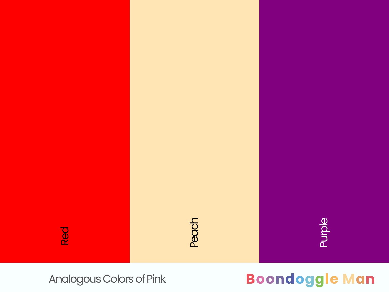
Analogous Colors of Pink
Analogous colors sit next to each other on the color wheel, creating harmonious combinations. Analogous colors for pink (#FFC0CB) include:
Red (#FF0000)
Red brings out the passion and vibrancy in pink. Cherry red (#DE3163), crimson red (#DC143C), and ruby red (#E0115F) work well with pink. Avoid neon reds (#FF00FF), which can look garish.
Use red tones sparingly against pink backdrops for exciting impact. Try a cherry throw rug in a modern pink, grey and wood room. Style a bashful pink dress with matching bold ruby heels and jewelry.
Peach (#FFE5B4)
Peach shares pink’s inherent warmth and brightness. Pastel peach (#FFE5B4) and melon peach (#FFA07A) complement pink’s cheeriness. Deeper orange peach shades can sometimes clash with or overpower soft pinks.
Incorporate peach accents into pink interiors and fashion. Add a peach pillow to a dusty pink couch. Style a baby pink top with melon peach shorts and accessories for a lively look.
Purple (#800080)
Purple brings out pink’s sense of whimsy and luxury. Lilac (#C8A2C8), lavender (#B57EDC) and wisteria (#C6A0E5) purple complement pink nicely. Avoid neon purples (#BF00FF), which may overwhelm.
Use pale purple accents against pink backdrops for contrast. Try lilac wall art and textiles in a bright pink room. Pair a blush pink dress with wisteria purple shoes and jewelry.
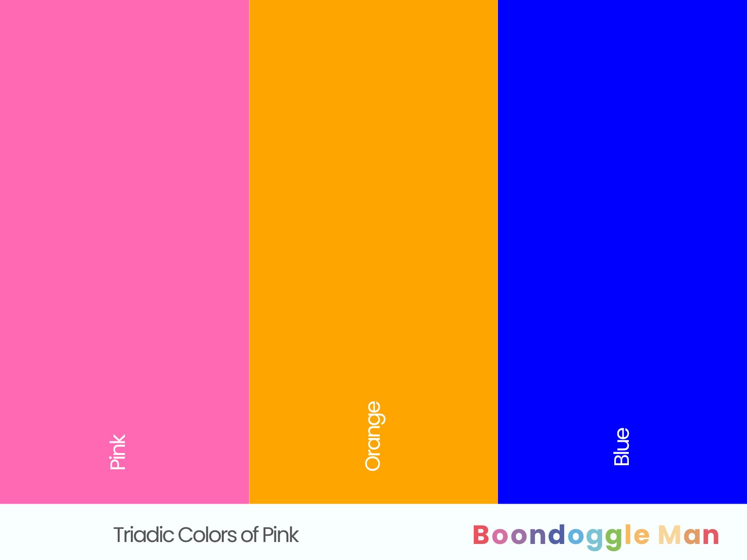
Triadic Colors of Pink
Triadic schemes use three colors equally spaced on the wheel for bold effects. The triadic colors for pink (#FFC0CB) are orange (#FFA500) and blue (#0000FF).
Orange (#FFA500)
Orange provides energetic contrast to pink’s romance. Coral (#FF7F50), peach (#FFE5B4), and cantaloupe orange (#FF8243) complement pink nicely. Neon orange (#FF5F1F) can overwhelm light pinks.
Incorporate muted orange accents into soft pink spaces and outfits. Add a coral pillow to a baby pink couch. Style a bashful pink dress with cantaloupe orange shoes and jewelry.
Blue (#0000FF)
Blue has a cooling, tranquilizing effect on lively pink. Baby blue (#89CFF0), sky blue (#87CEEB), and robin’s egg blue (#1C86EE) work best with pink. Navy blue (#000080) may be too harsh.
Use pale blues carefully against pink backdrops for balance. Try robin’s egg blue wall art and textiles in a bright pink room. Or pair a fuchsia top with baby blue skirt and accessories.
What Colors That Go With Pink
45 gorgeous color combinations featuring different shades of pink. Discover beautiful ways to use pink color schemes throughout your home’s interior.
Vibrant Pink Color Palettes
Vivid pinks packed with energy look best paired with equally bold, saturated accent colors. These fun combos add spirited color to modern spaces.
1. Hot Pink, Royal Blue, Chartreuse
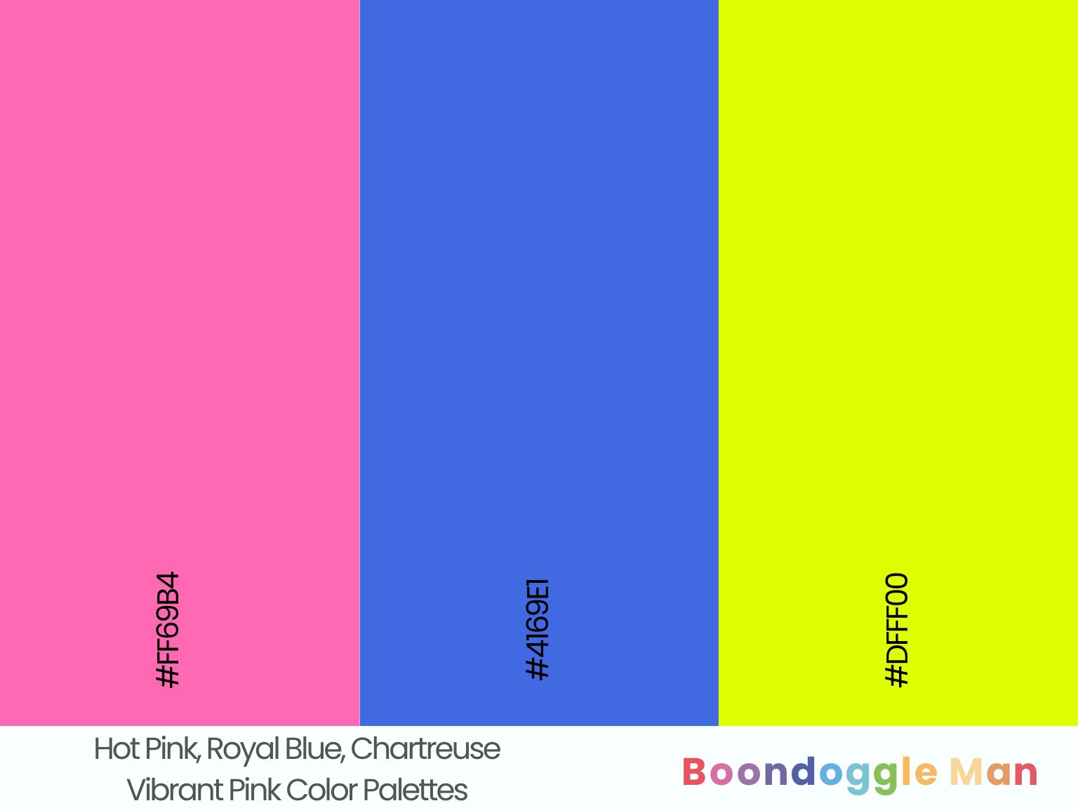
Hex Codes: #FF69B4, #4169E1, #DFFF00
Sassy hot pink complements regal royal blue and electric chartreuse perfectly for an energetic, psychedelic palette. Great for kids’ rooms.
2. Magenta, Lime Green, Orange
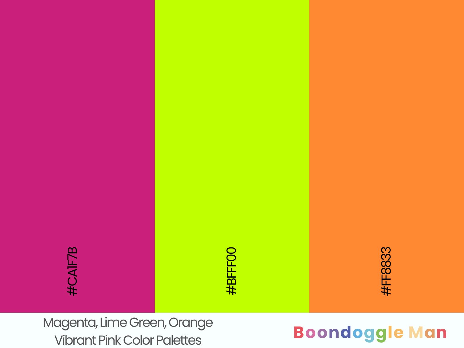
Hex Codes: #CA1F7B, #BFFF00, #FF8833
Vibrant magenta makes cheerful lime green and tangy orange shine in this lively, tropical combo. Use it to brighten kitchens, offices and recreation rooms.
3. Fuchsia, Turquoise, Sunshine Yellow
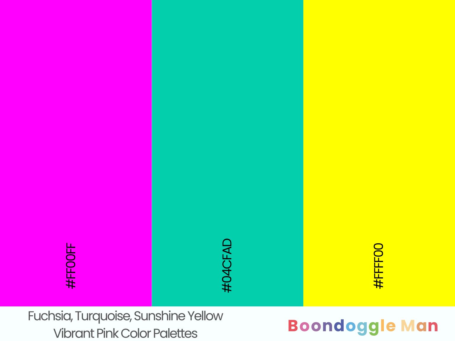
Hex Codes: #FF00FF, #04CFAD, #FFFF00
Playful fuchsia looks fab alongside refreshing turquoise and bright sunshine yellow. A fun palette for modern living spaces.
4. Cerise, Robin’s Egg Blue, Apple Green
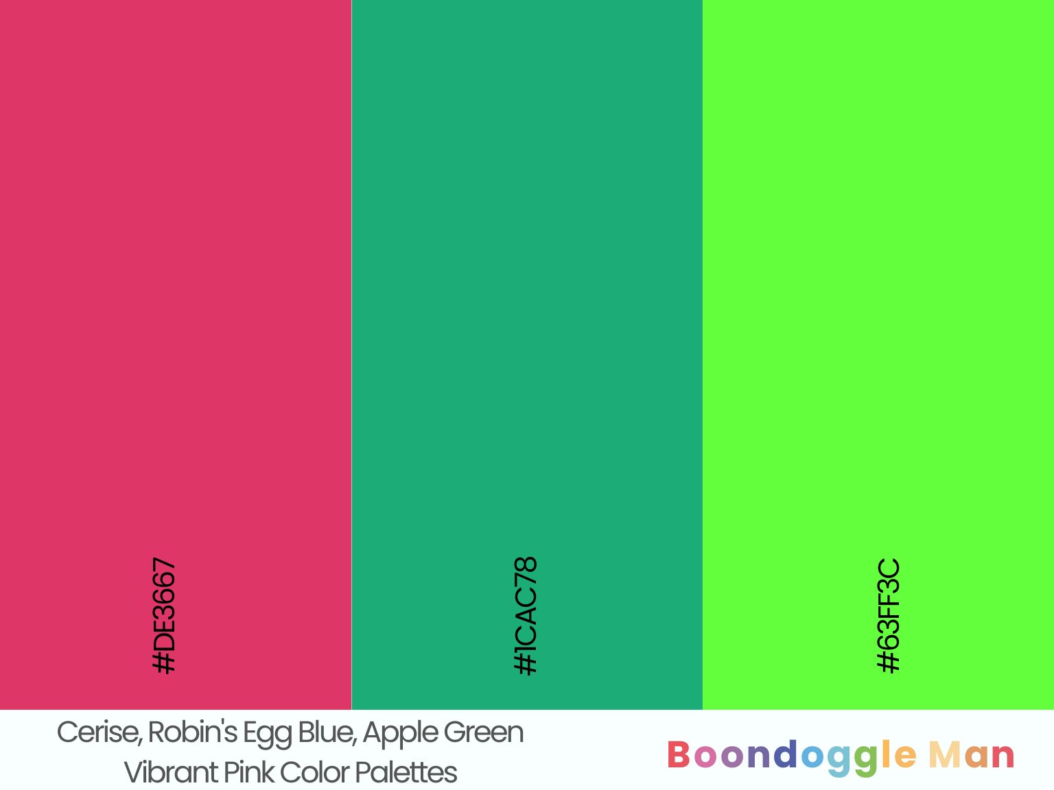
Hex Codes: #DE3667, #1CAC78, #63FF3C
Sensational cerise complements soft robin’s egg blue and crisp apple green beautifully. Perfect for a girls’ bedroom or playroom.
5. Amaranth Pink, Teal, Lemon Yellow
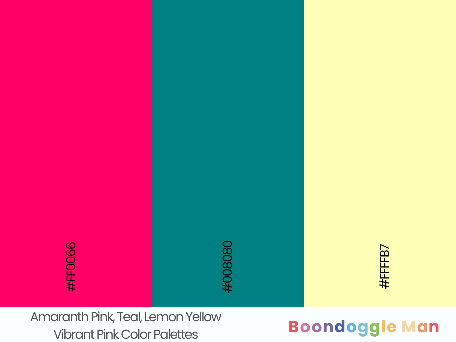
Hex Codes: #FF0066, #008080, #FFFFB7
Vibrant amaranth pink walls make cool teal furnishings and zesty lemon yellow accents really pop. Great for adding energy to a room.
6. Raspberry Pink, Mint Green, Sky Blue
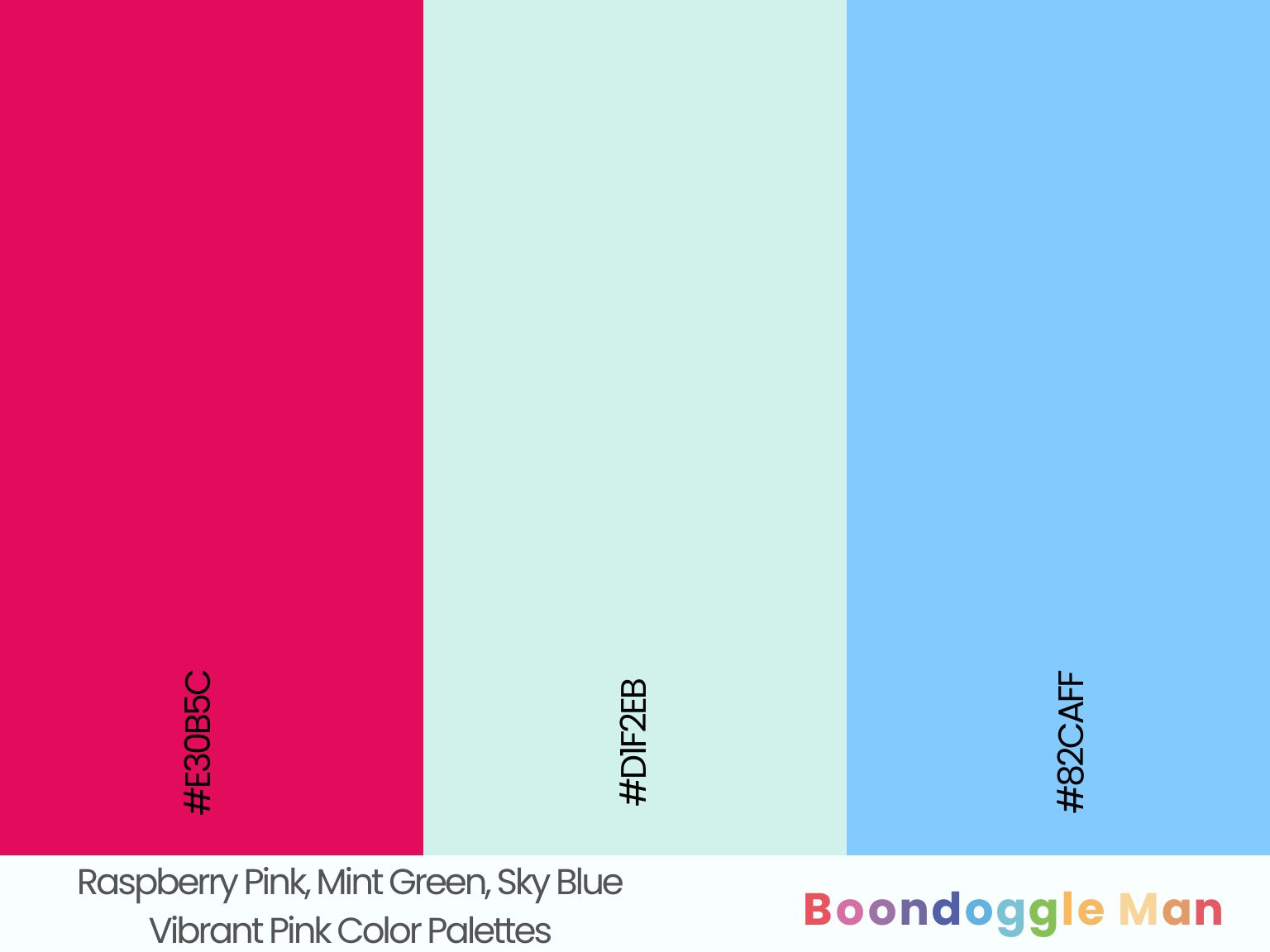
Hex Codes: #E30B5C, #D1F2EB, #82CAFF
Tangy raspberry pink looks lively with refreshing mint green and breezy sky blue accents. A perfect spring and summer palette.
Earthy Pink Color Combinations
Dusty pink tones complement natural materials like wood, linen, and jute beautifully. These laidback palettes have a relaxed boho vibe.
7. Blush, Walnut Wood, Khaki Linen
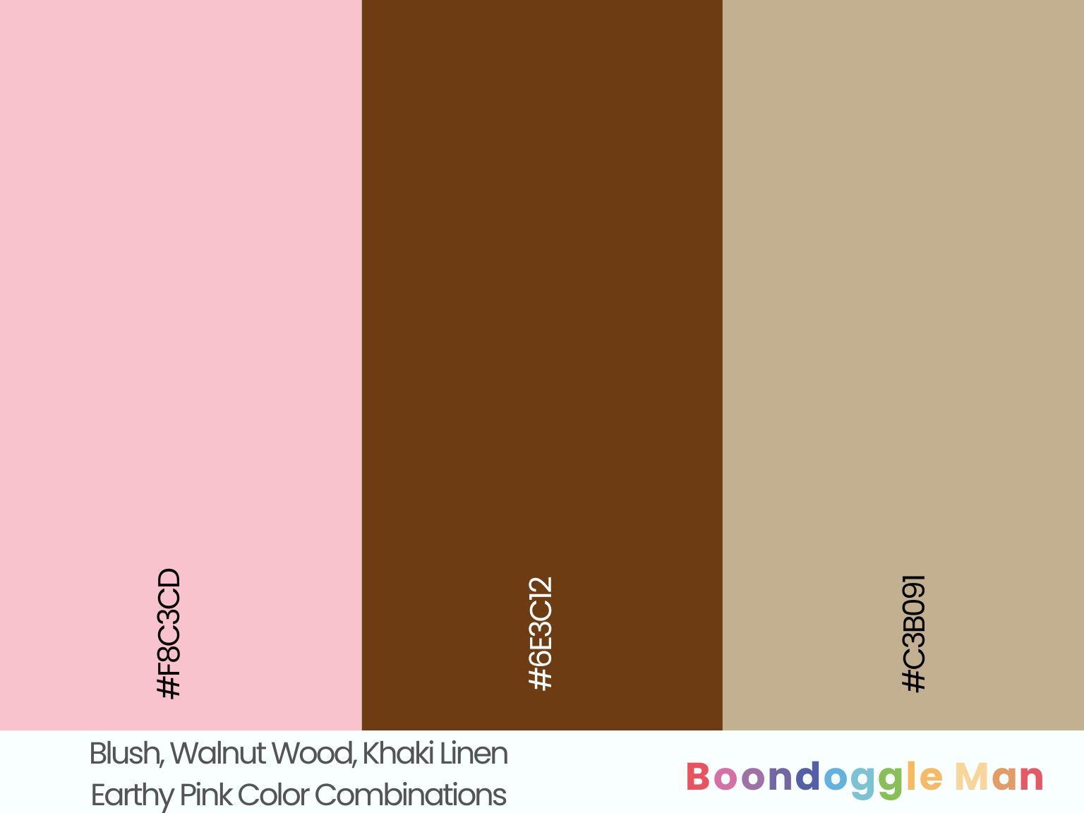
Hex Codes: #F8C3CD, #6E3C12, #C3B091
Soft blush walls enhanced by rich walnut wood furniture and breezy khaki linen upholstery create cozy boho harmony.
8. Mauve, Oak Wood, Sand Stone
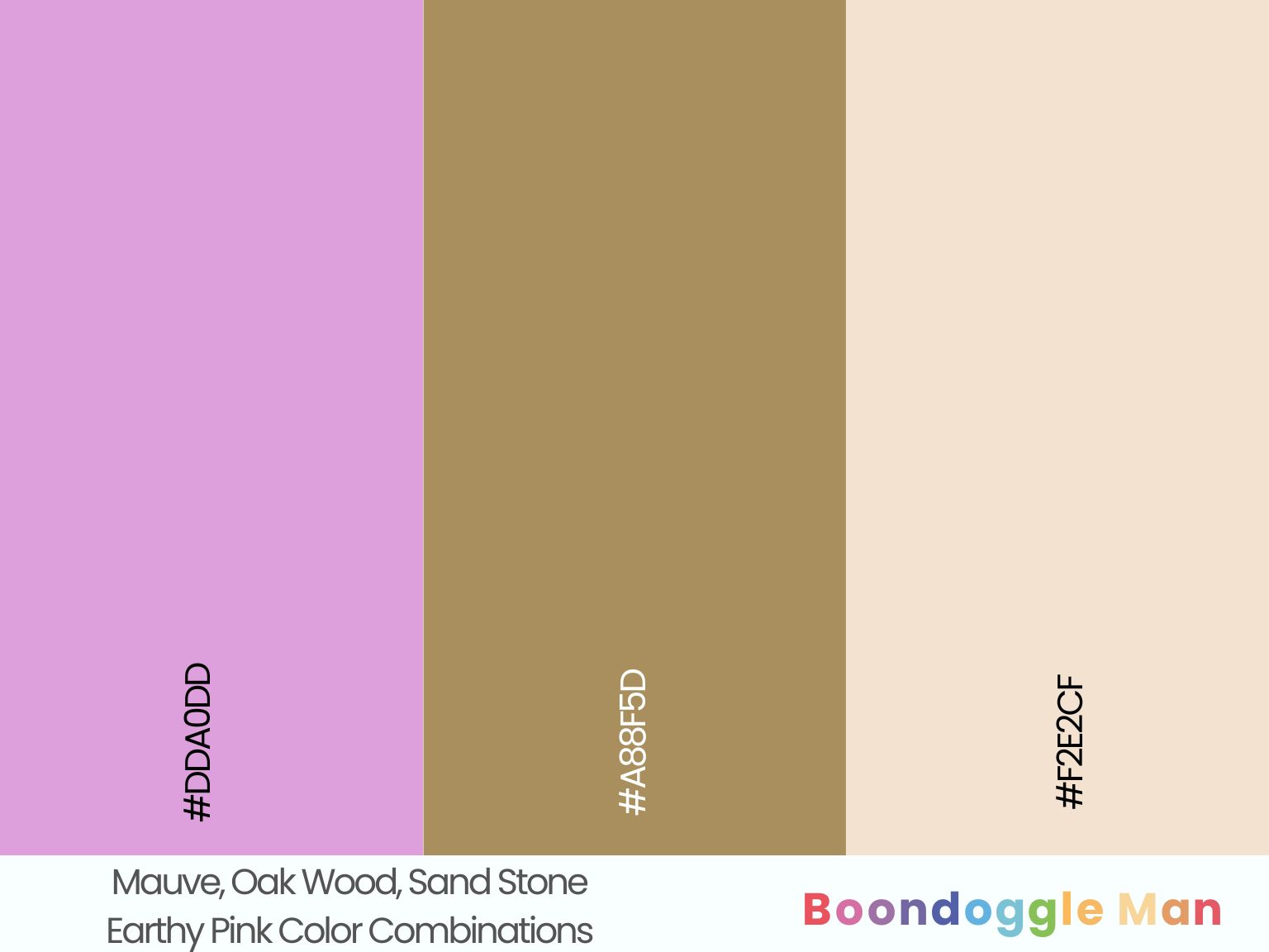
Hex Codes: #DDA0DD, #A88F5D, #F2E2CF
Airyan mauve walls complemented by textural oak wood beams and organic sand stone floors makes for an earthy palette with harmony. Perfect for rustic cottages.
9. Dusty Rose, Umber, Hemp Fabric
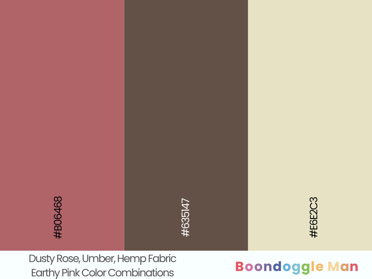
Hex Codes: #B06468, #635147, #E6E2C3
Subtly weathered dusty rose walls pop beside organic umber leather and natural hemp fabric accents. A laidback boho palette.
10. Salmon, Jute, Mushroom Brown
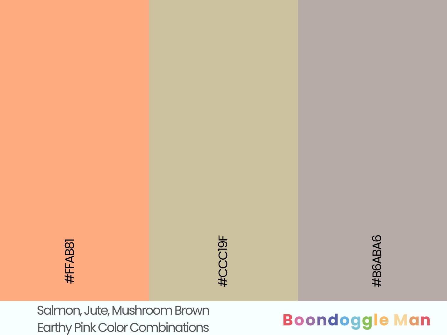
Hex Codes: #FFAB81, #CCC19F, #B6ABA6
Fresh salmon pink complements textural jute rugs and earthy mushroom brown furniture perfectly in this nature-inspired palette.
11. Peachy Pink, Chambray Fabric, Chestnut Wood
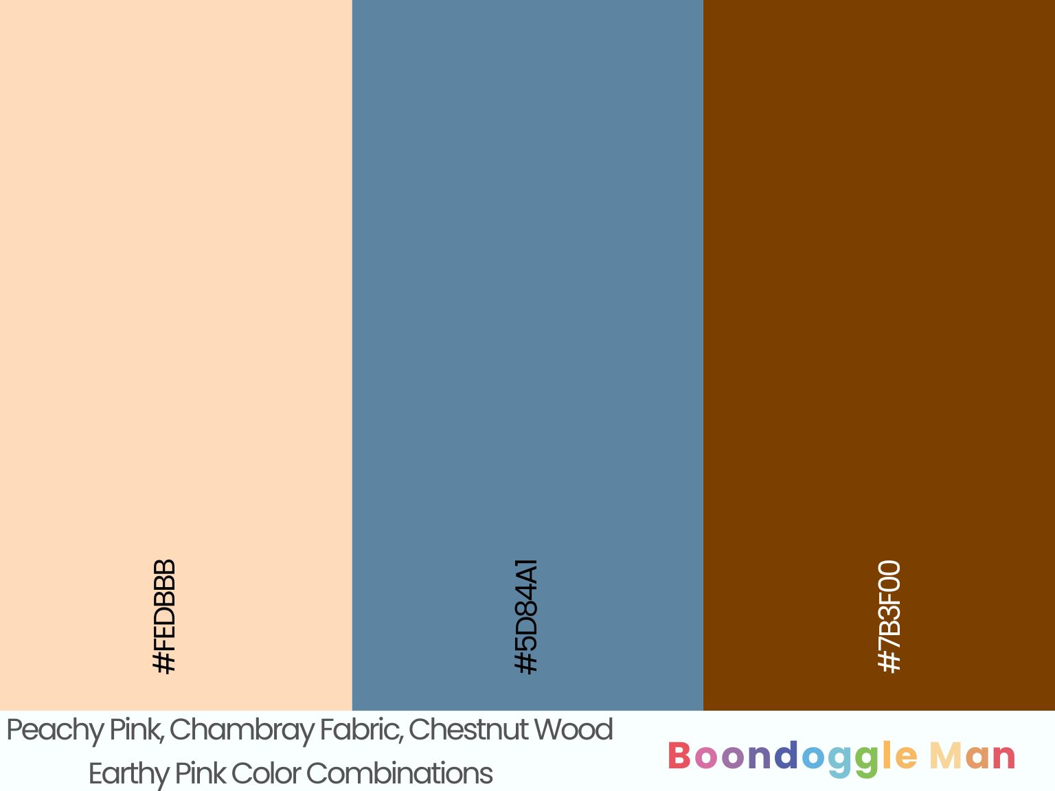
Hex Codes: #FEDBBB, #5D84A1, #7B3F00
Sweet peachy pink walls enhanced by casual chambray fabric upholstery and rich chestnut wood accents makes for cozy, boho style.
12. Rose Tan, Denim, Saddle Brown Leather
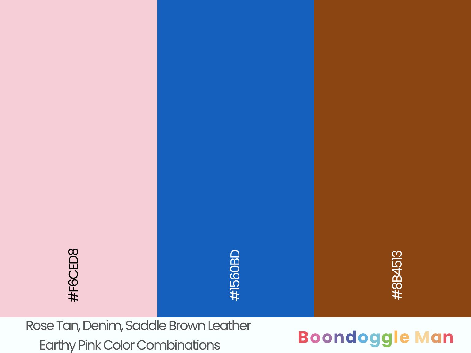
Hex Codes: #F6CED8, #1560BD, #8B4513
Soft rose tan walls complement timeless denim blue and rugged saddle brown leather furniture beautifully. A versatile boho palette.
Retro Pink Color Schemes
Nostalgic pink tones look fabulous paired with heritage hues like aqua, yellow and red. Use these fun combos to create spirited vintage flair.
13. Bubblegum Pink, Turquoise, Butter Yellow
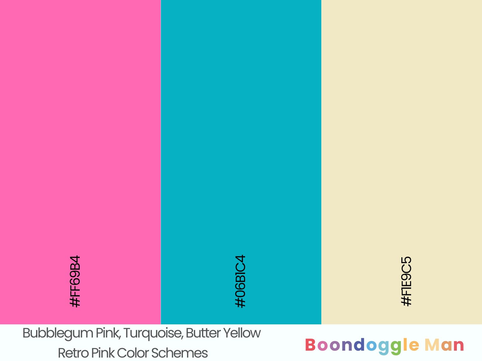
Hex Codes: #FF69B4, #06B1C4, #F1E9C5
Playful bubblegum pink walls enhanced by refreshing turquoise accents and warm butter yellow finishes create retro charm. Perfect for a kids’ room.
14. Flamingo Pink, Avocado Green, Crimson Red
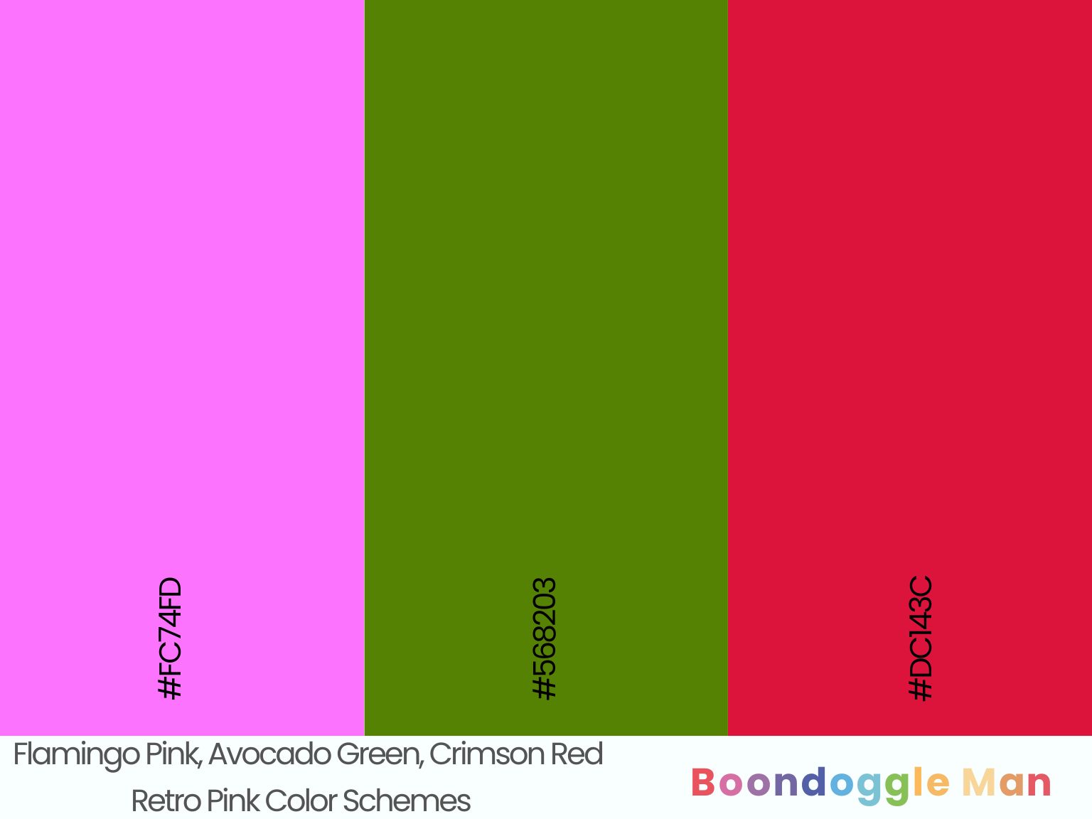
Hex Codes: #FC74FD, #568203, #DC143C
Fun flamingo pink furniture pops beautifully against retro avocado green walls and an official crimson red front door. Great for playrooms and rec rooms.
15. Salmon Pink, Mint Green, Sky Blue
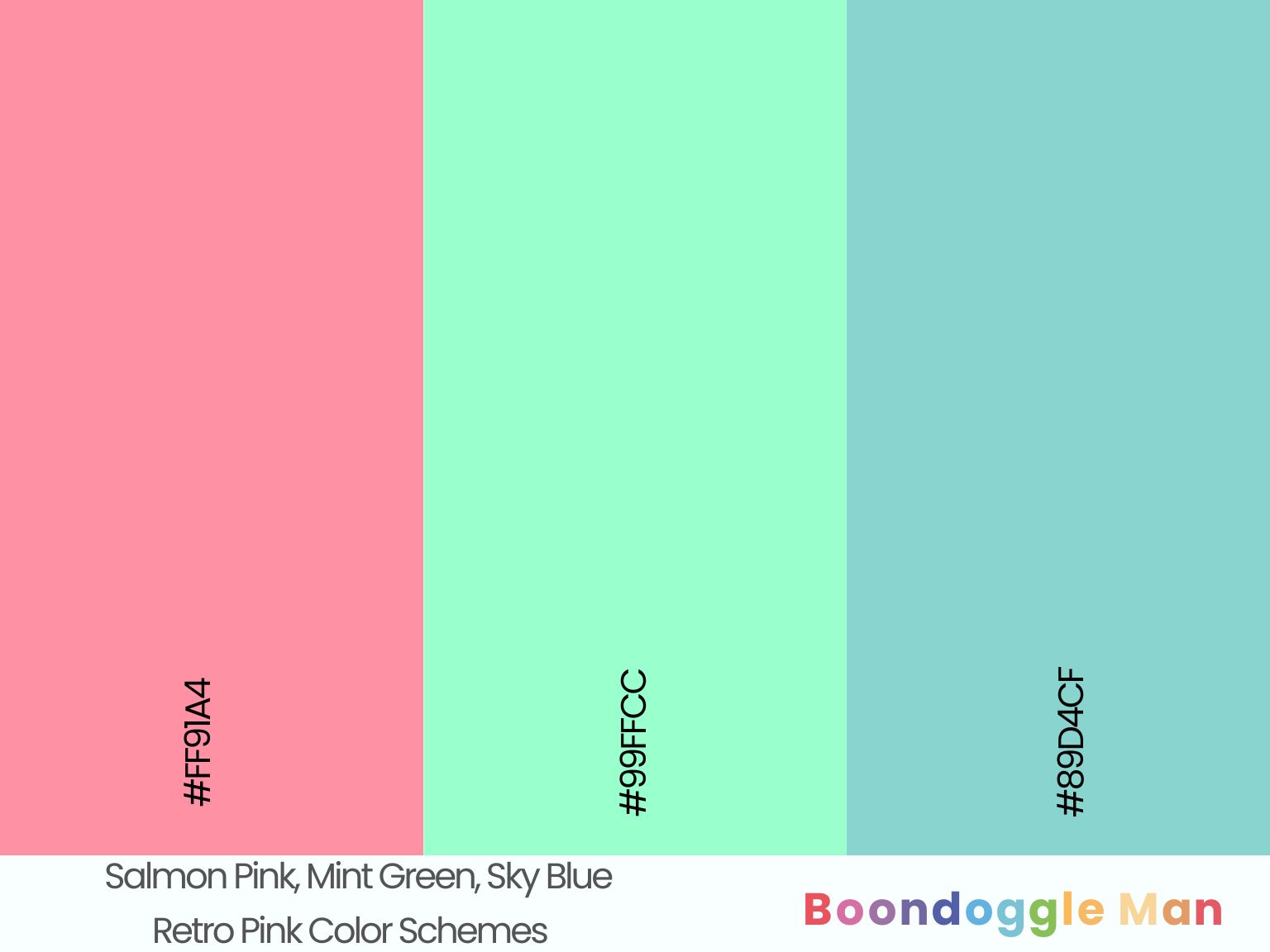
Hex Codes: #FF91A4, #99FFCC, #89D4CF
Natural salmon pink complements retro mint green cabinetry and breezy sky blue backsplash tiles perfectly in this cheerful vintage kitchen.
16. Carnation Pink, Robin’s Egg Blue, Sunshine Yellow
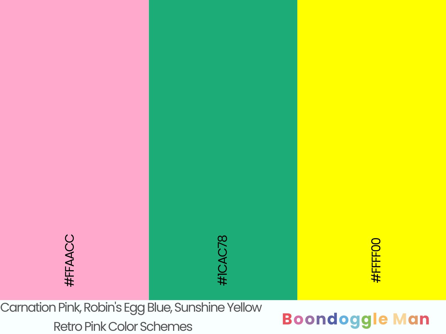
Hex Codes: #FFAACC, #1CAC78, #FFFF00
Sweet carnation pink accents enhanced by playful robin’s egg blue and bright sunshine yellow evokes carefree cottage charm.
Soft Pink Color Palettes
Pale pink pastels create an angelic, dreamy feeling when combined with other soft hues like lilac, peach and seafoam green.
17. Blush, Lilac, Cream
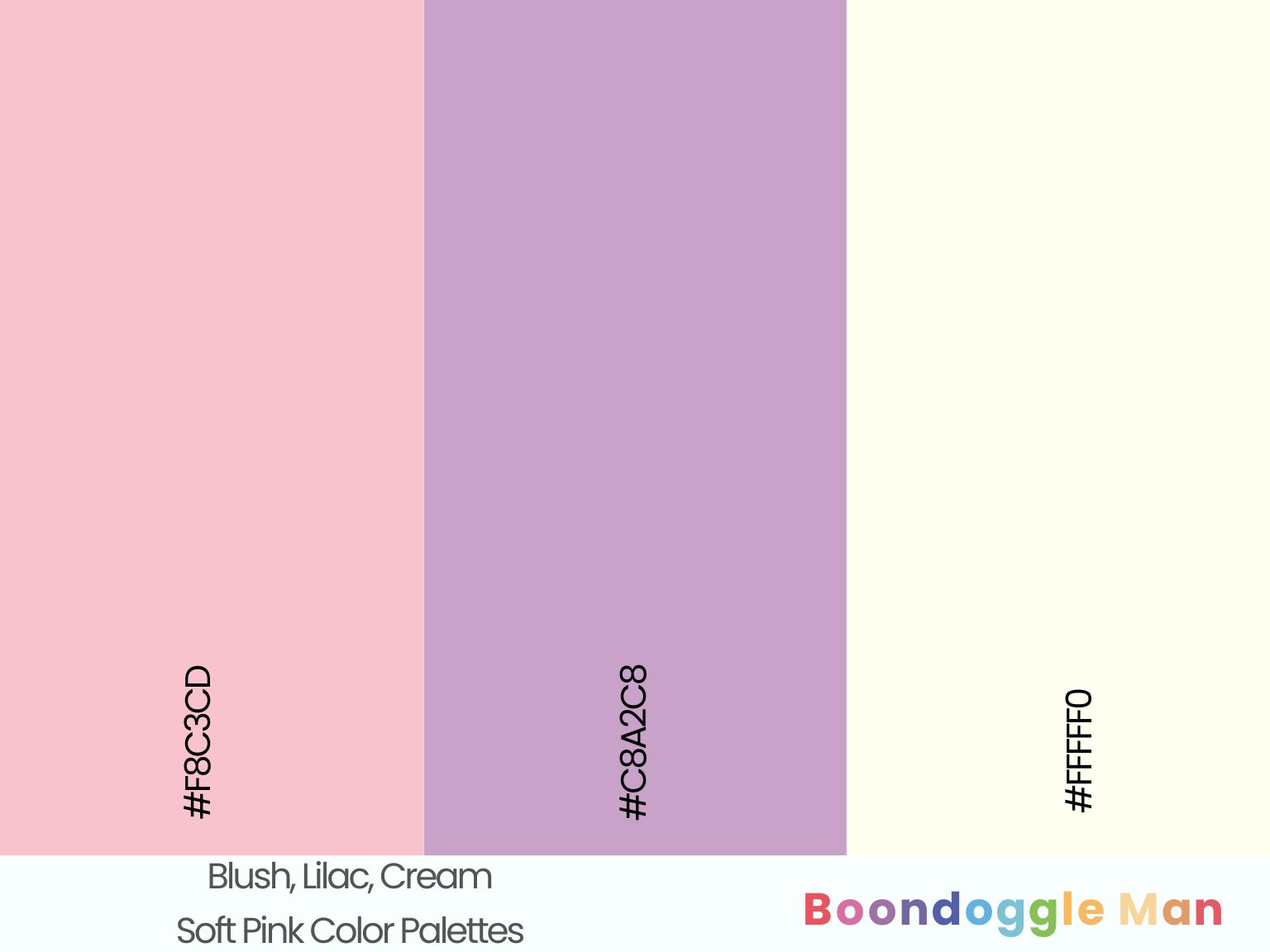
Hex Codes: #F8C3CD, #C8A2C8, #FFFFF0
Delicate blush walls complemented by airy lilac accents and bright cream trim makes for an ethereal, romantic palette. Perfect for bedrooms and powder rooms.
18. Ballet Pink, Lavender, Ice Blue
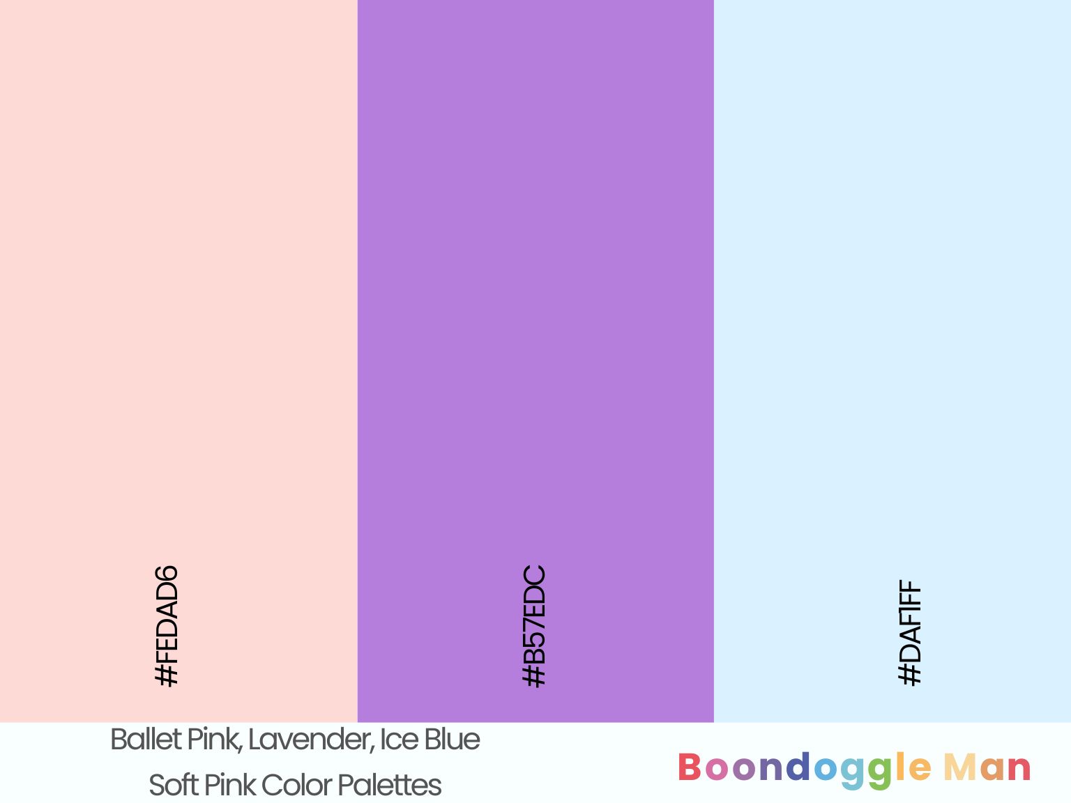
Hex Codes: #FEDAD6, #B57EDC, #DAF1FF
Sweet ballet pink furniture enhanced by soothing lavender tones and icy blue accents makes for a dreamy girl’s bedroom.
19. Peach Pink, Periwinkle Blue, Linen White
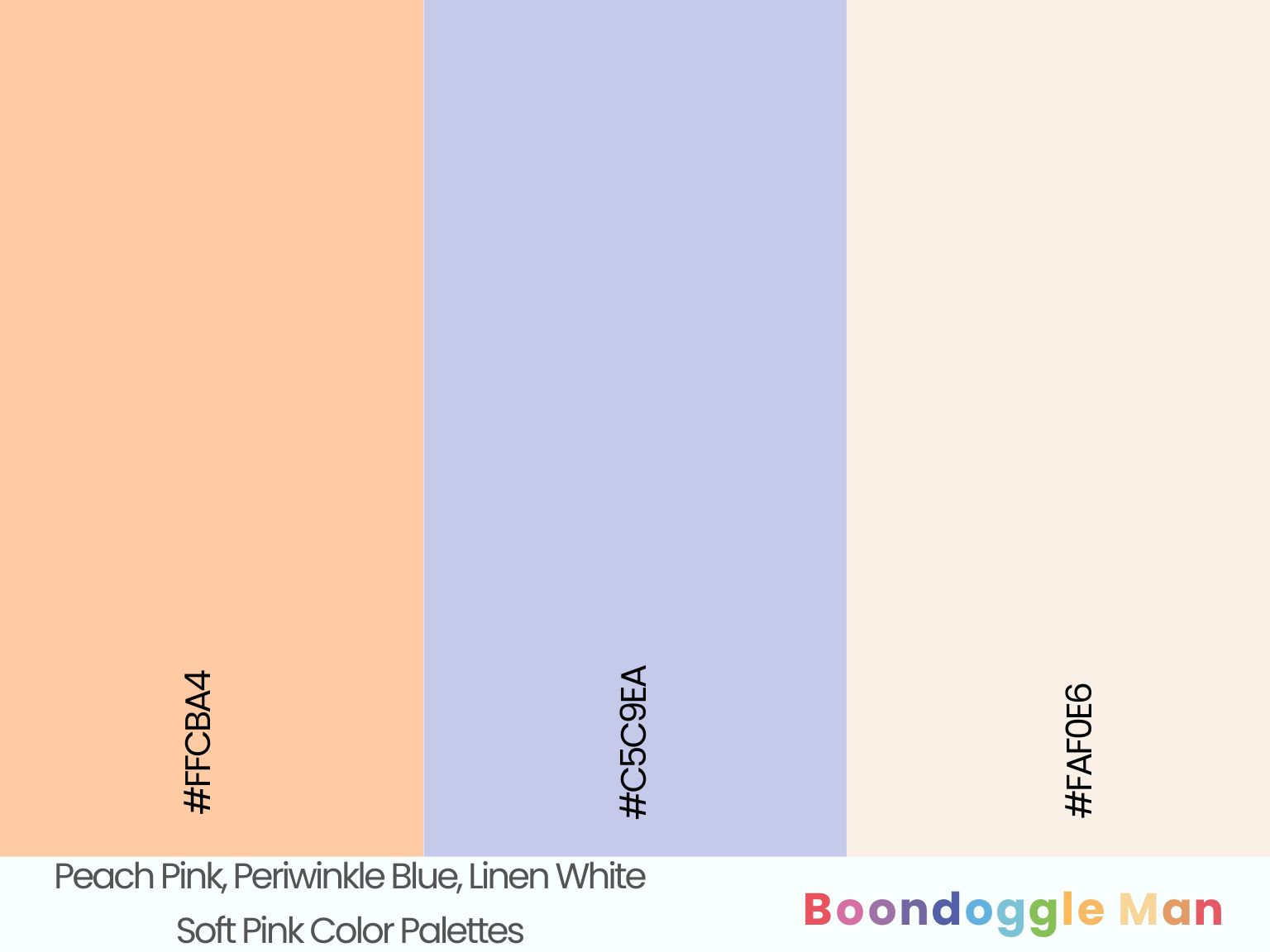
Hex Codes: #FFCBA4, #C5C9EA, #FAF0E6
Warm peach pink walls look bright and cheery beside pretty periwinkle blue decor and natural linen white trim. An uplifting springtime palette.
20. Fairy Pink, Aqua Green, Sand Beige
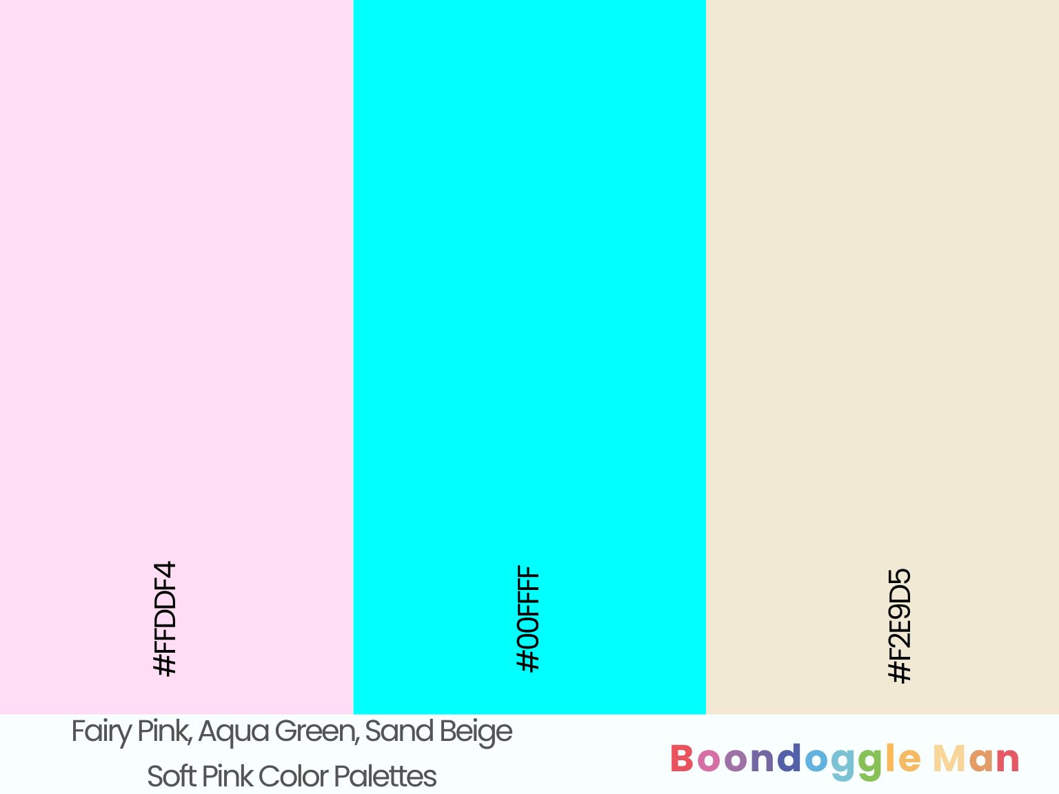
Hex Codes: #FFDDF4, #00FFFF, #F2E9D5
Ethereal fairy pink makes aqua green accents pop against natural sand beige walls. Perfect for a beach cottage or nursery.
21. Rose, Pale Blue, Buttercream White
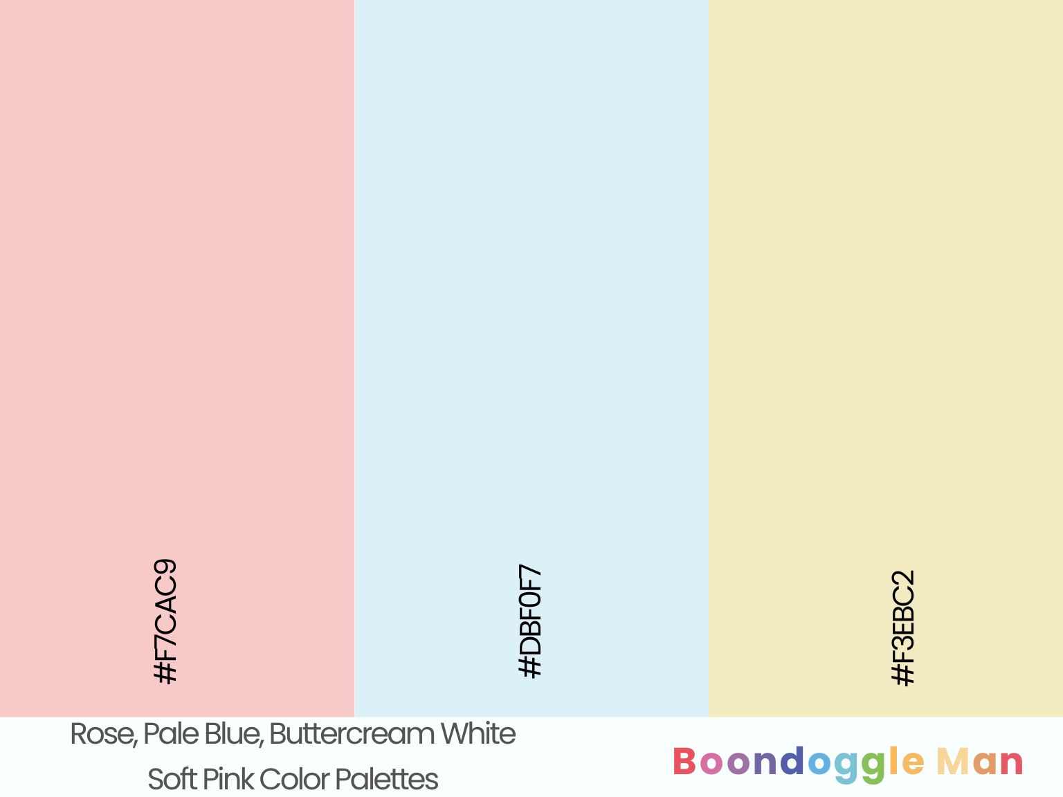
Hex Codes: #F7CAC9, #DBF0F7, #F3EBC2
Romantic rose walls complemented by breezy pale blue and buttery buttercream white create a welcoming feminine palette. Lovely in bedrooms and bathrooms.
22. Shell Pink, Lavender Gray, Silver
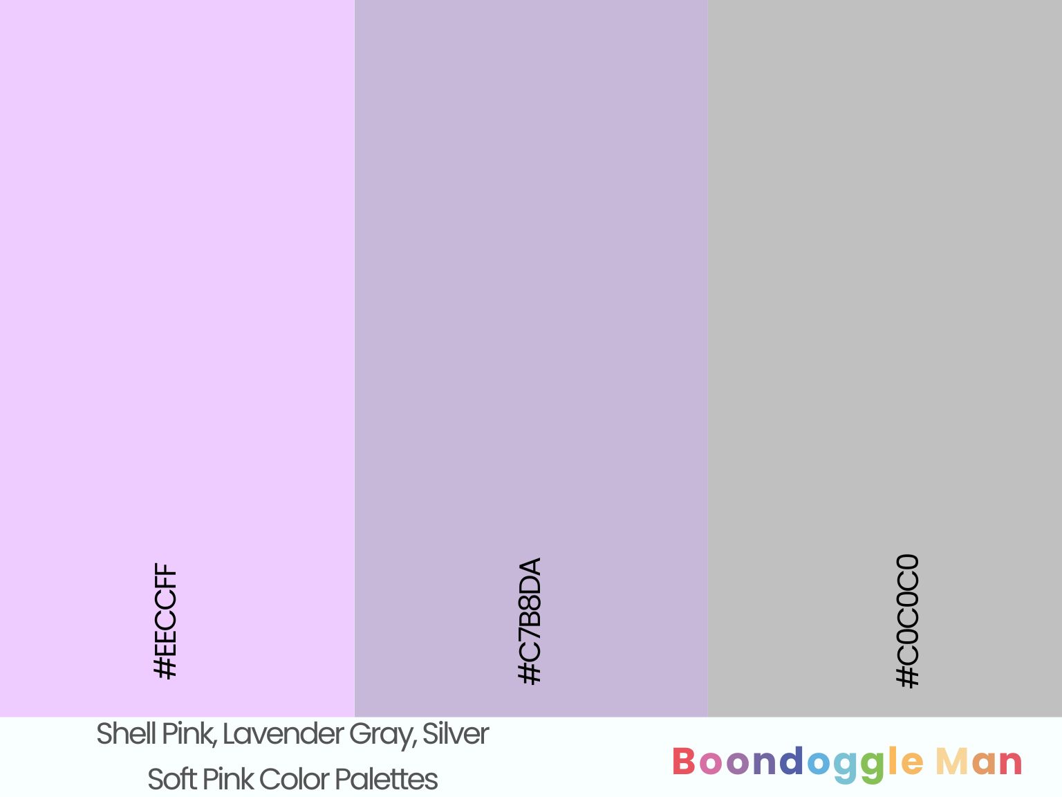
Hex Codes: #EECCFF, #C7B8DA, #C0C0C0
Subtle shell pink enhances airy lavender gray and sleek silver accents beautifully for delicate, weightless elegance.
Gray Pink Color Combinations
Muted grays nicely tone down brightly colored pink walls while adding sophistication. These versatile palettes work well in minimalist spaces.
23. Carnation Pink, Ash Gray, White
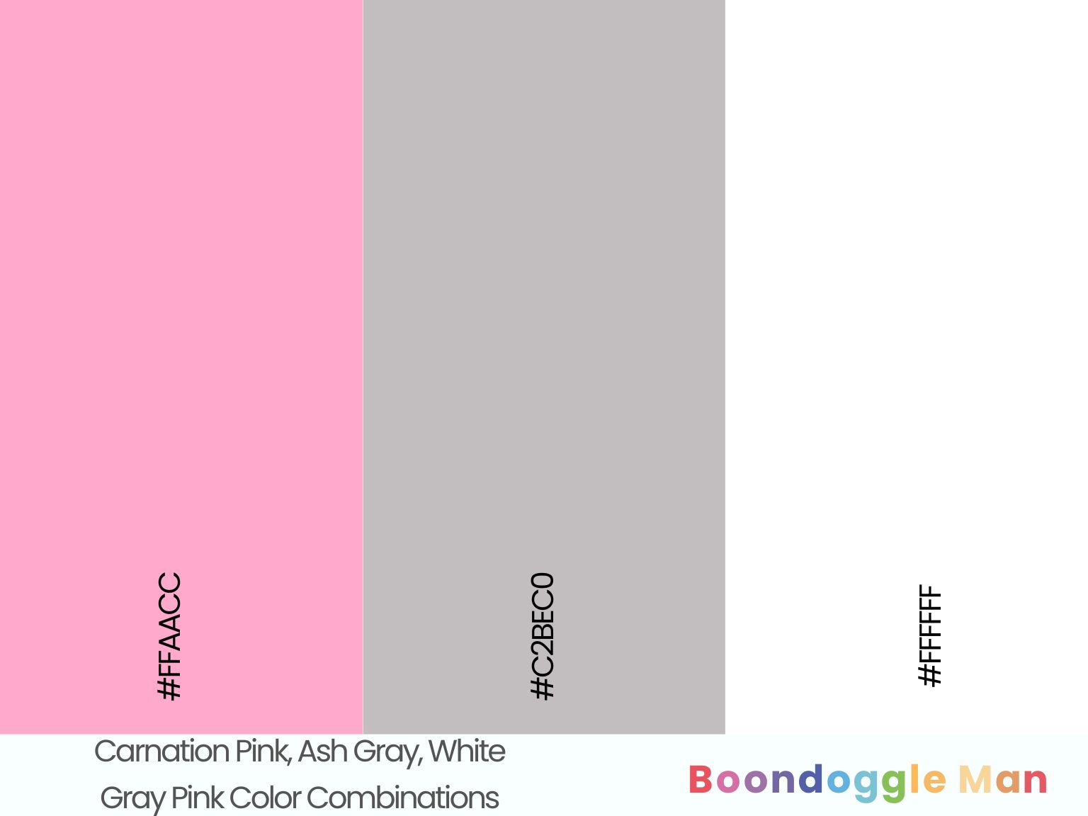
Hex Codes: #FFAACC, #C2BEC0, #FFFFFF
Vibrant carnation pink walls come alive against weathered ash gray wood tones and bright white trim. The gray prevents overwhelming sweetness.
24. Watermelon Pink, Charcoal Gray, Bone White
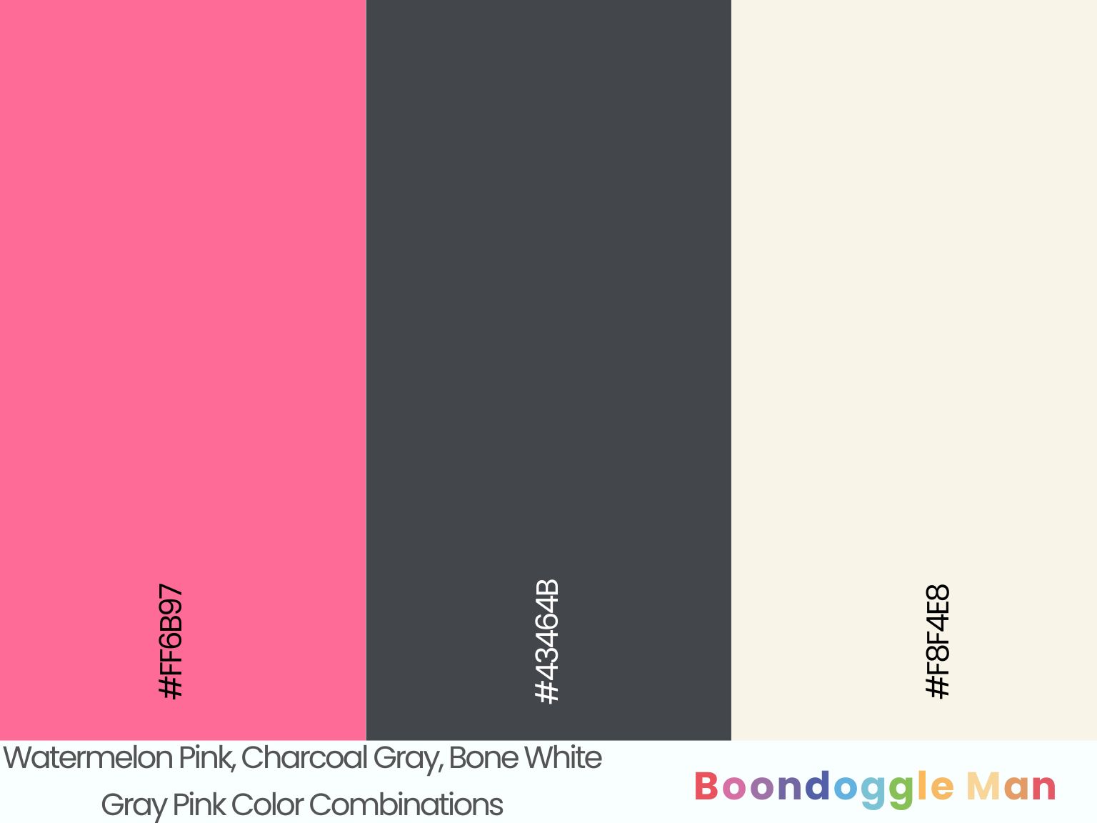
Hex Codes: #FF6B97, #43464B, #F8F4E8
Bold watermelon pink makes a dramatic statement beside smokey charcoal gray furniture and organic bone white architectural accents.
25. Salmon Pink, Heather Gray, Cream
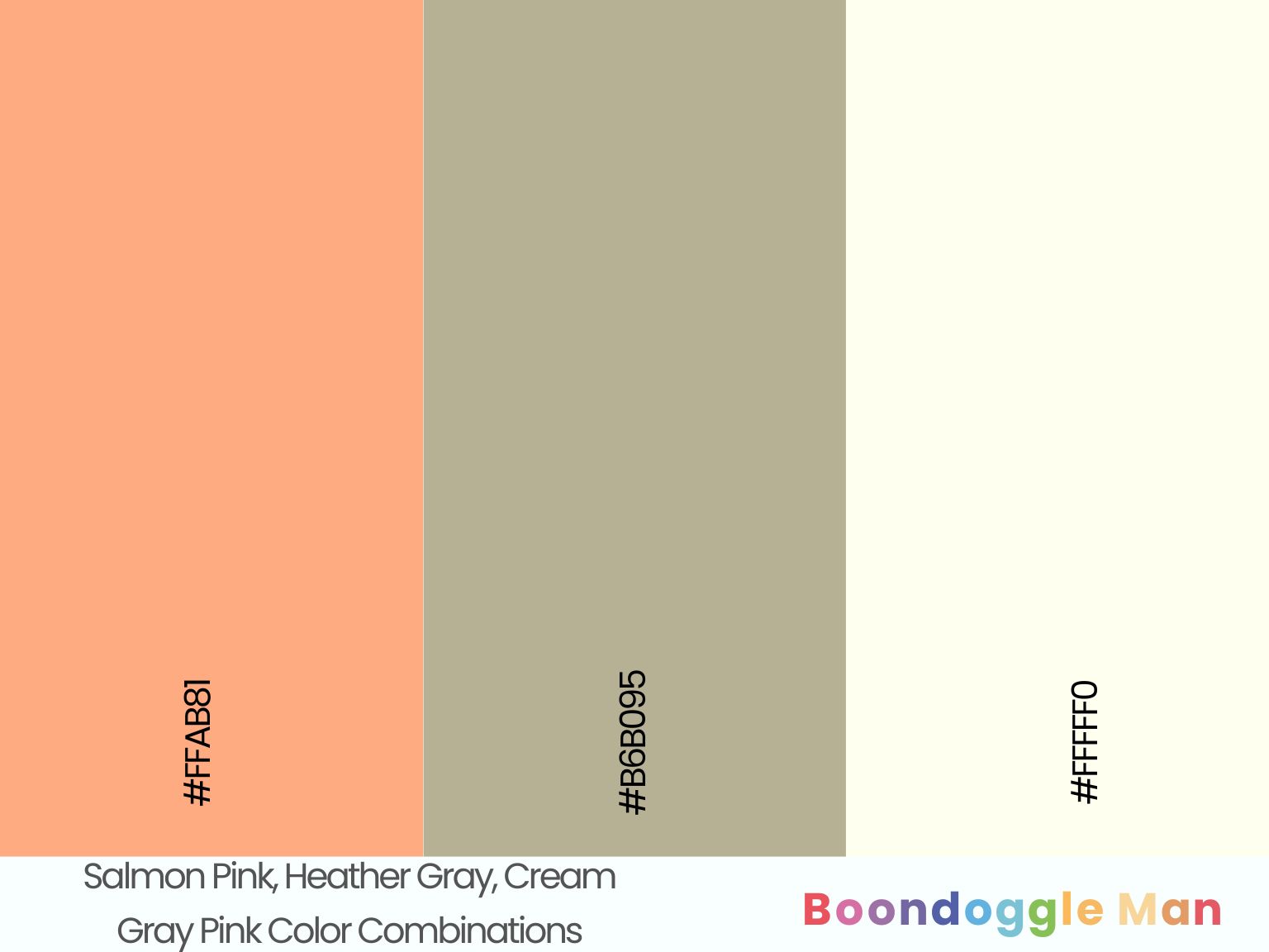
Hex Codes: #FFAB81, #B6B095, #FFFFF0
Warm salmon pink walls look stylish and refined with soft heather gray cabinetry and fizzy cream backsplash tiles. A lovely kitchen palette.
26. Mauve, Blue Gray, Pearl White
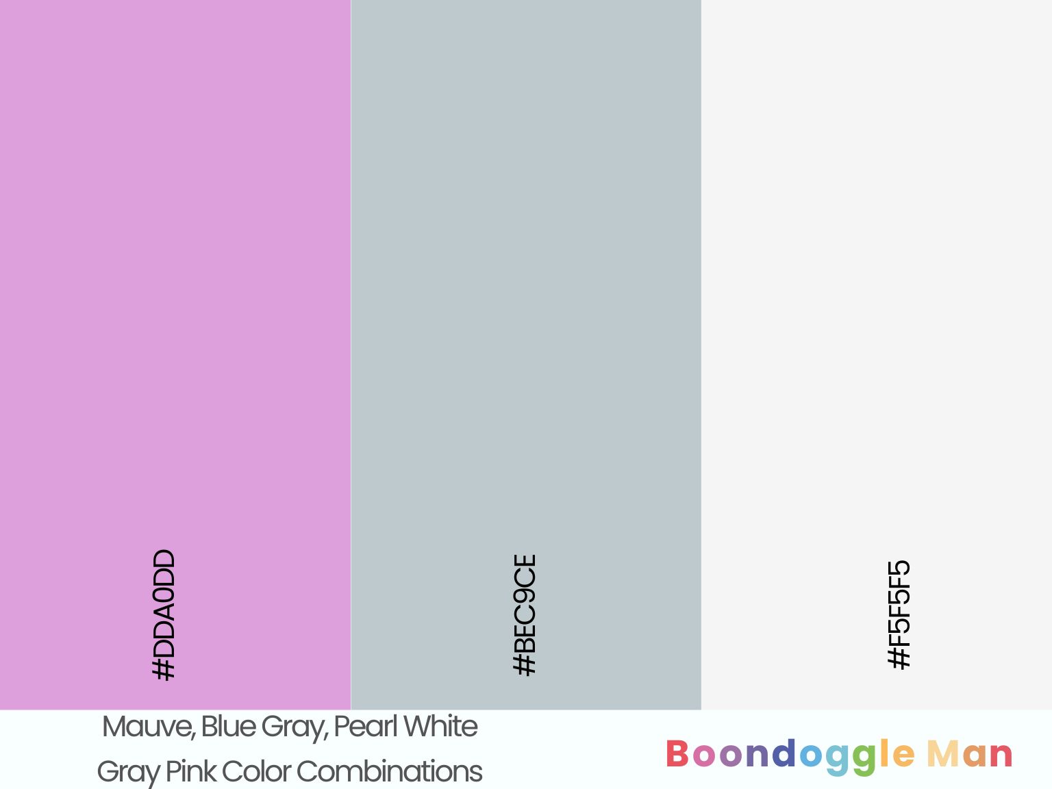
Hex Codes: #DDA0DD, #BEC9CE, #F5F5F5
Romantic mauve walls contrast beautifully with weathered blue gray wood floors and pearly pearl white trim for stylish cohesion.
27. Dusty Rose, Dove Gray, Alabaster White
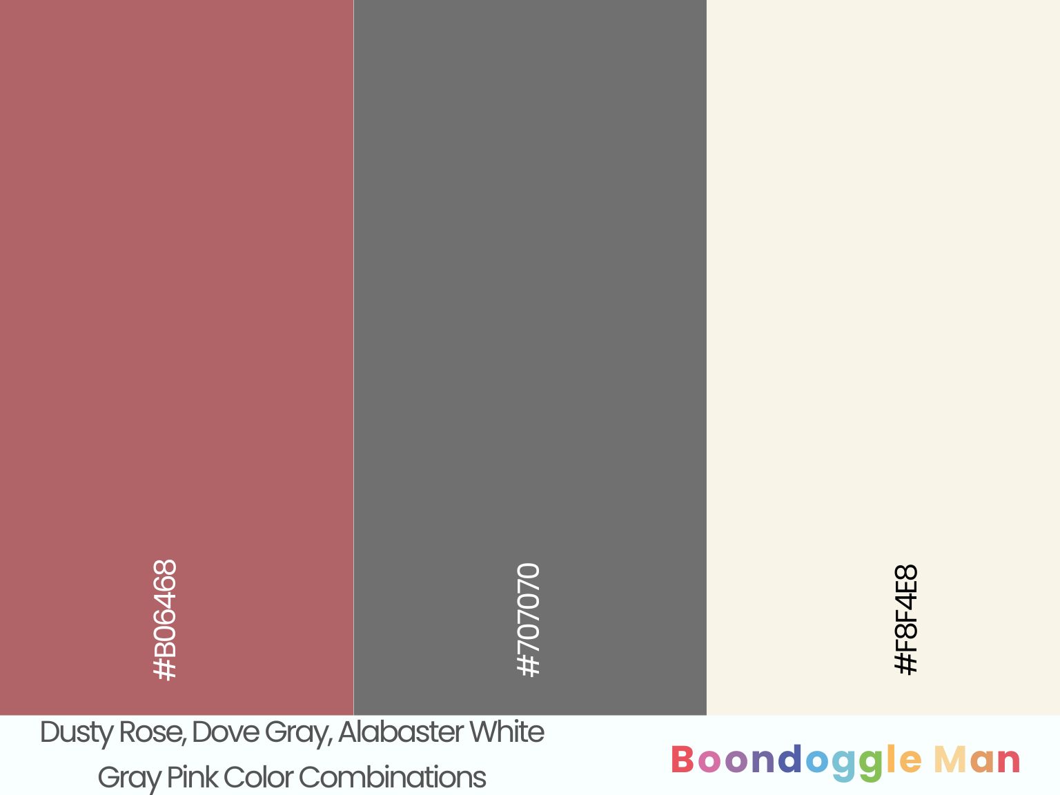
Hex Codes: #B06468, #707070, #F8F4E8
Muted dusty rose walls enhanced by soothing dove gray furniture and organic alabaster white architectural accents makes for a versatile neutral palette with personality.
Rich Pink Color Palettes
Sultry pinks take on a bold, exotic flair when accented with jewel tones, black and metallics. These glamorous combos create lavish elegance.
28. Raspberry Pink, Emerald Green, Rose Gold
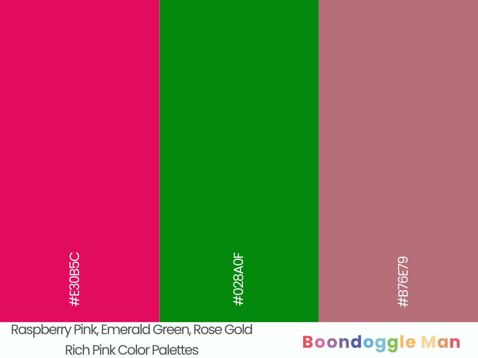
Hex Codes: #E30B5C, #028A0F, #B76E79
Succulent raspberry pink walls complemented by vibrant emerald green accents and romantic rose gold finishes create lush, opulent appeal.
29. Magenta, Sapphire Blue, Copper
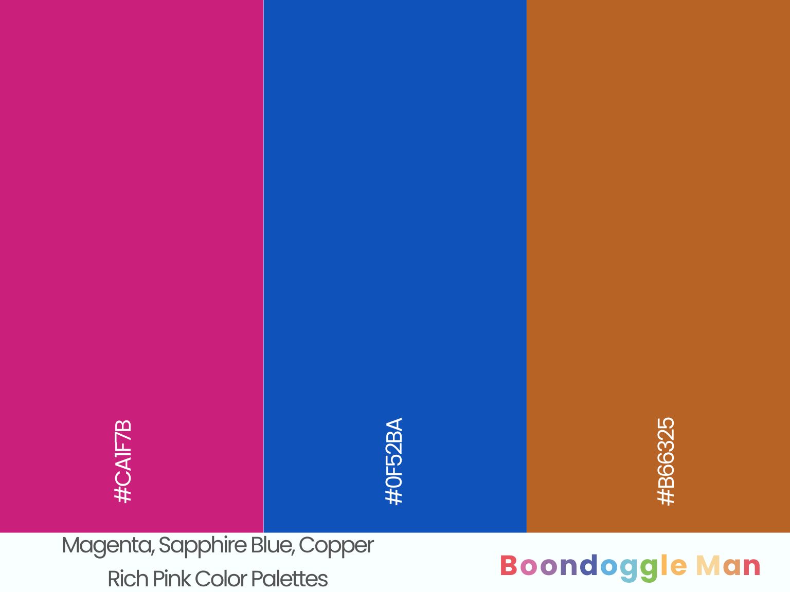
Hex Codes: #CA1F7B, #0F52BA, #B66325
Vibrant magenta makes a dramatic statement against rich sapphire blue furnishings and glimmering copper lighting fixtures. A bold combo for modern dining rooms.
30. Amaranth Pink, Eggplant Purple, Gold
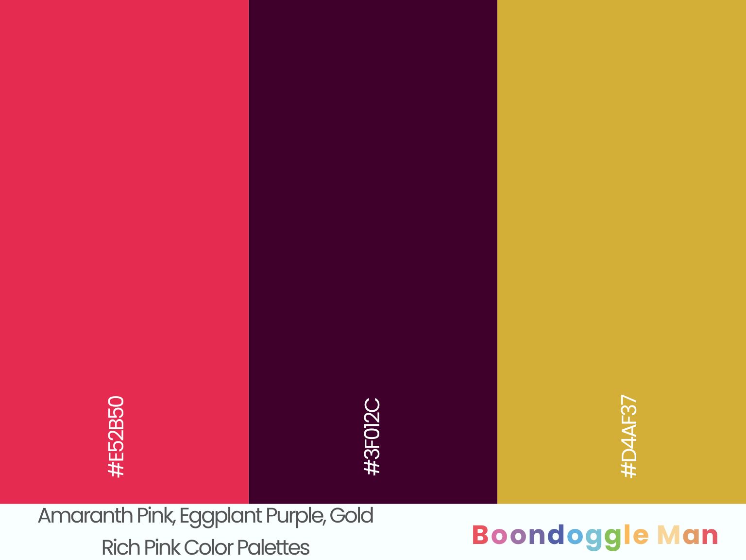
Hex Codes: #E52B50, #3F012C, #D4AF37
Sensational amaranth pink walls look striking beside mysterious eggplant purple accents and glamorous gold finishes.
31. Fuchsia, Navy Blue, Silver
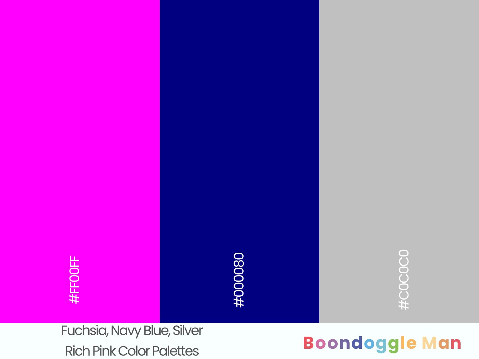
Hex Codes: #FF00FF, #000080, #C0C0C0
Shocking fuchsia combined with classic navy blue and polished silver accents makes for a regal, <strong>haute couture</strong> palette. Perfect for bold, fashion-forward spaces.
Vintage Pink Color Combinations
Dusky pinks complement retro teals, yellows and sky blue beautifully for playful, nostalgic charm. Use these combos to create cheerful cottage style.
32. Peach Pink, Robin’s Egg Blue, Butter Yellow
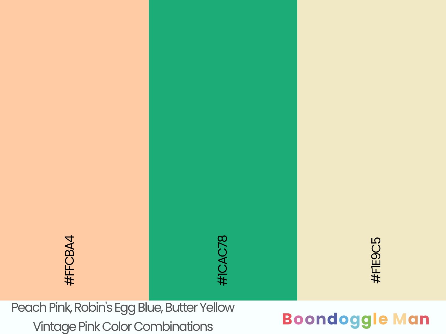
Hex Codes: #FFCBA4, #1CAC78, #F1E9C5
Sweet peach pink walls enhanced by playful robin’s egg blue accents and warm butter yellow finishes have a youthful cottage charm.
33. Carnation Pink, Seafoam Green, Sky Blue
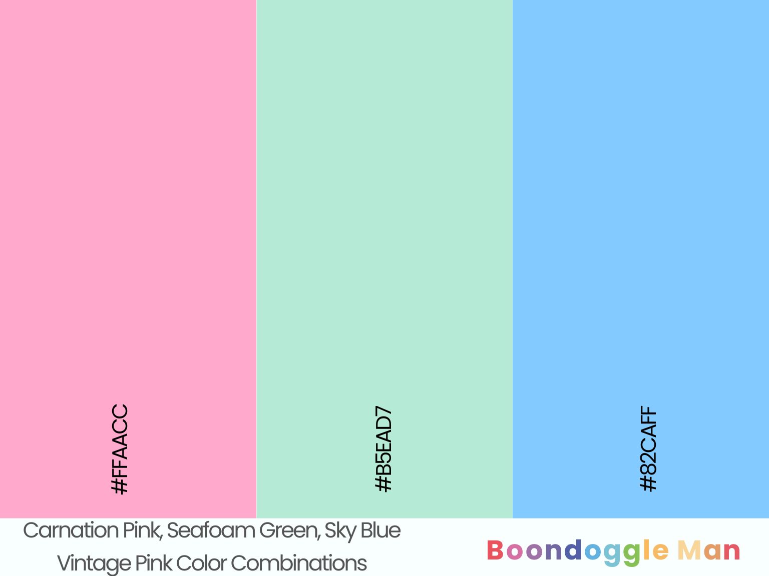
Hex Codes: #FFAACC, #B5EAD7, #82CAFF
Cheerful carnation pink complements refreshing seafoam green cabinetry and breezy sky blue backsplash tiles perfectly in this retro kitchen.
34. Blush, Periwinkle Blue, Sage Green
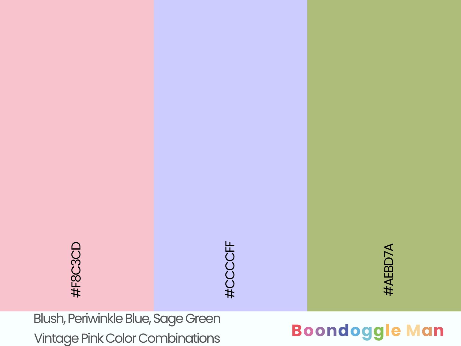
Hex Codes: #F8C3CD, #CCCCFF, #AEBD7A
Romantic blush walls look beautiful beside pretty periwinkle blue furniture and organic sage green textile accents. A lovely shabby chic palette.
35. Ballet Pink, Denim Blue, Daffodil Yellow
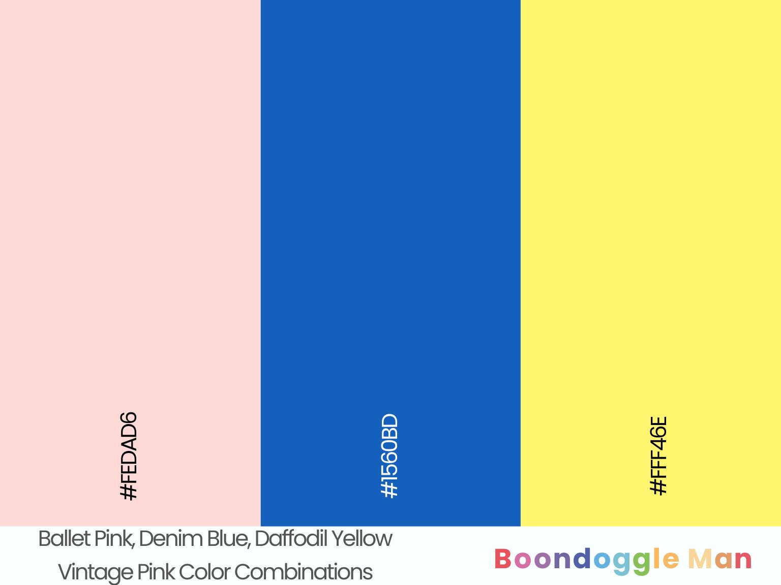
Hex Codes: #FEDAD6, #1560BD, #FFF46E
Sweet ballet pink walls with faded denim blue accents and bright daffodil yellow front door make for a charming, laidback cottage exterior.
High Contrast Pink Color Schemes
Punchy pinks really stand out against crisp white and black. Add bold primary colors for maximum contrast and visual impact.
36. Hot Pink, Primary Blue, White
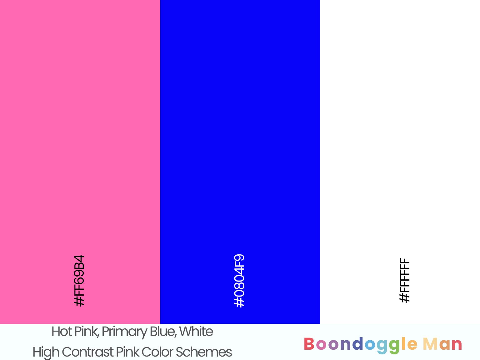
Hex Codes: #FF69B4, #0804F9, #FFFFFF
Sassy hot pink walls make vibrant blue architectural details and bright white wainscoting pop dramatically. A bold, lively statement.
37. Amaranth Pink, Black, Chartreuse
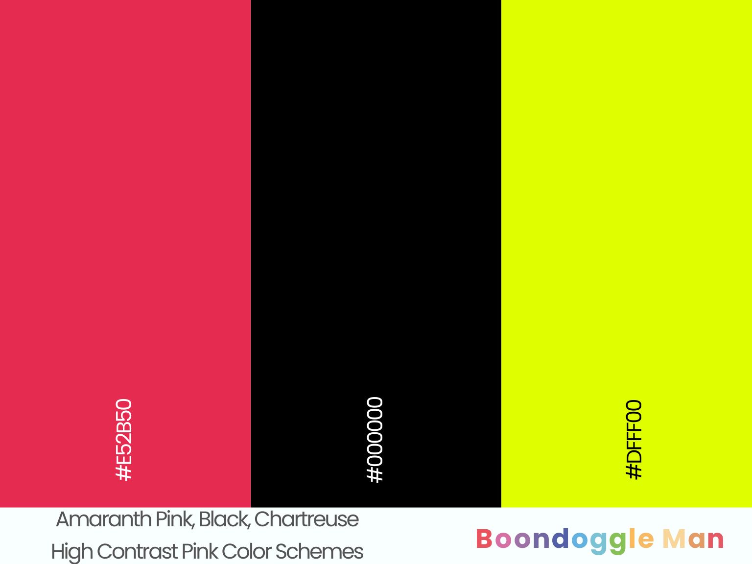
Hex Codes: #E52B50, #000000, #DFFF00
Sensational amaranth pink contrasted with sophisticated black furnishings and radiant chartreuse accents makes a dramatic artistic statement.
38. Cerise Pink, Cyan, White
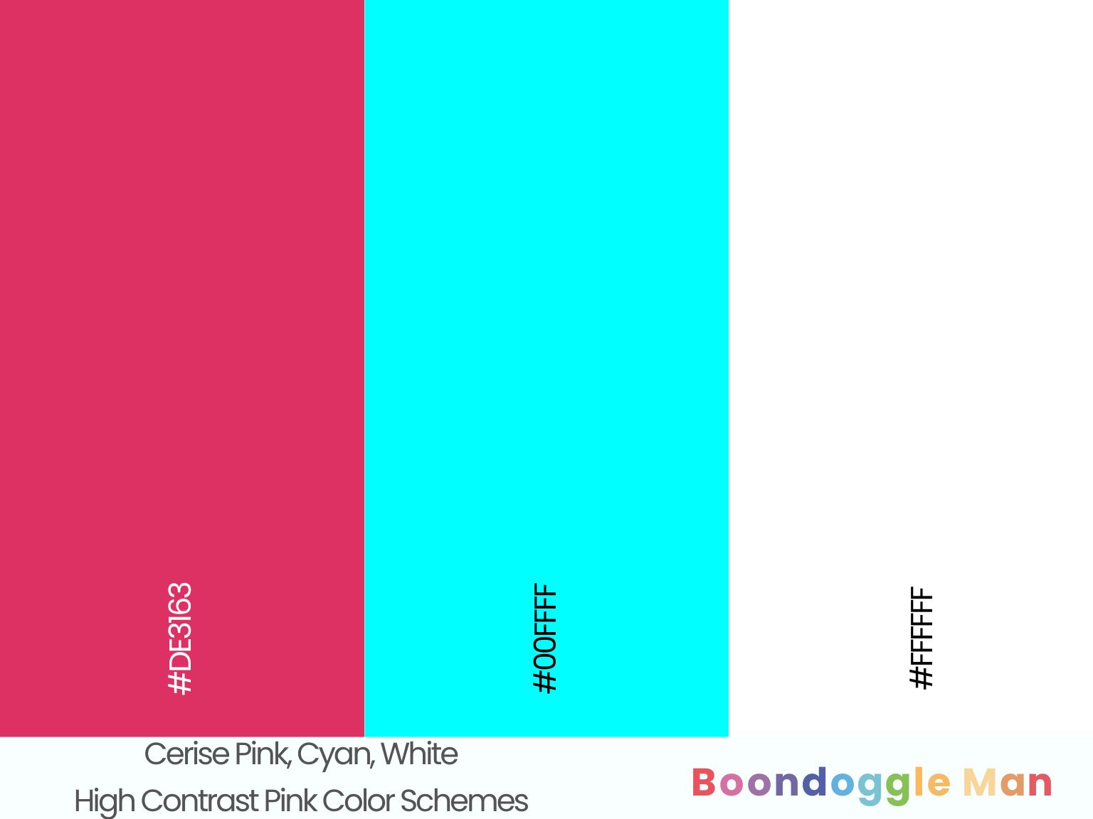
Hex Codes: #DE3163, #00FFFF, #FFFFFF
Vibrant cerise pink complements electric cyan accent chairs beautifully against crisp white walls and ceilings. A playful combination for a girls’ bedroom.
39. Magenta, Black, Dandelion Yellow
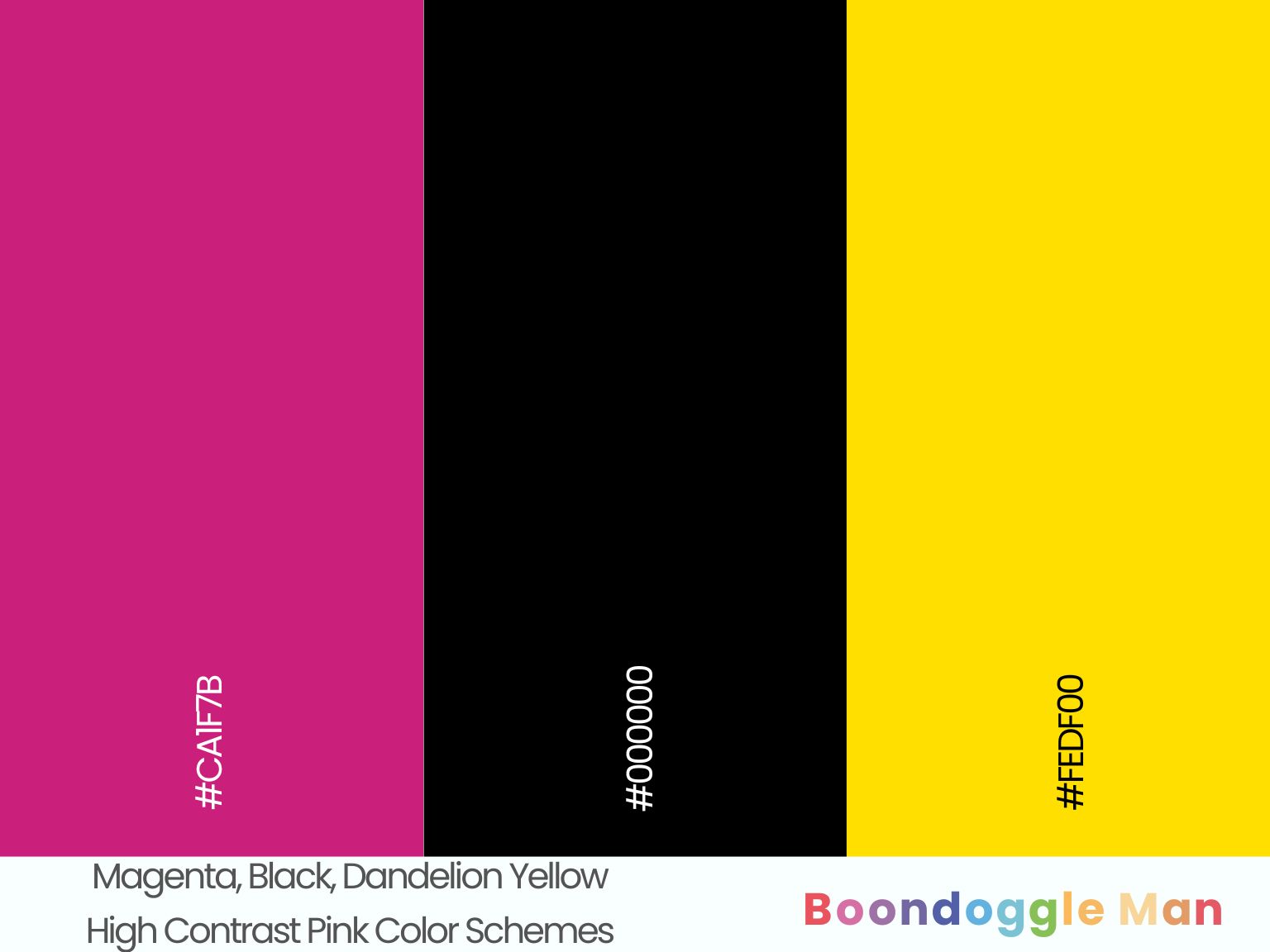
Hex Codes: #CA1F7B, #000000, #FEDF00
Shocking magenta wallpaper punctuated by classic black furnishings and sunny dandelion yellow pillows makes a bold, eccentric statement.
40. Raspberry Pink, White, Vermillion
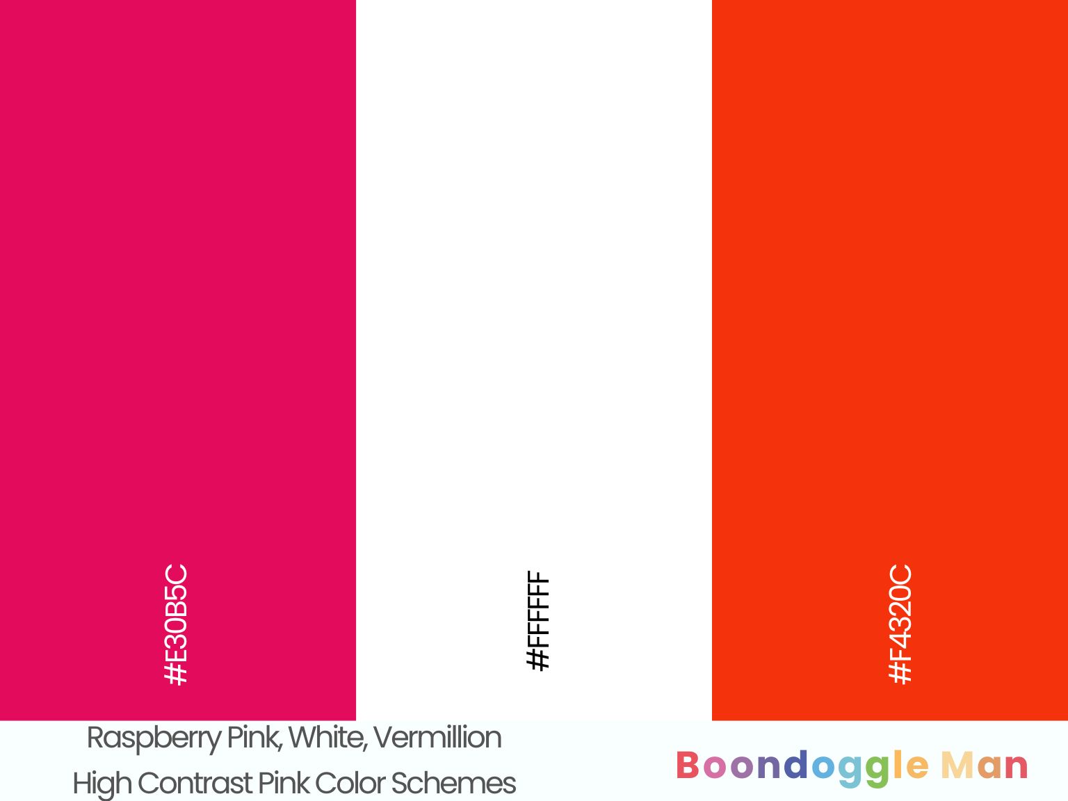
Hex Codes: #E30B5C, #FFFFFF, #F4320C
Tangy raspberry pink walls enhanced by bright white wainscoting and fiery vermillion orange accent wall create exciting contrast. Energizing and fun.
Pink and Pastel Color Schemes
Pink looks heavenly when combined with other soft pastels like lilac, peach, seafoam and sky blue. These dreamy palettes evoke springtime style.
41. Carnation Pink, Lavender, Buttercream
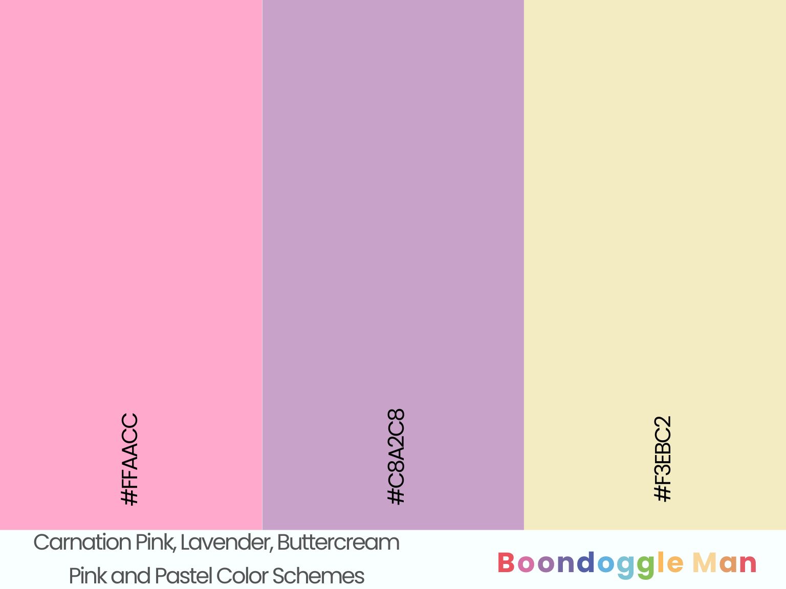
Hex Codes: #FFAACC, #C8A2C8, #F3EBC2
Playful carnation pink complements airy lavender and creamy buttercream beautifully for a delicious ice cream palette. Use this in kitchens, kids’ rooms and bathrooms.
42. Ballet Pink, Mint Green, Robin’s Egg Blue
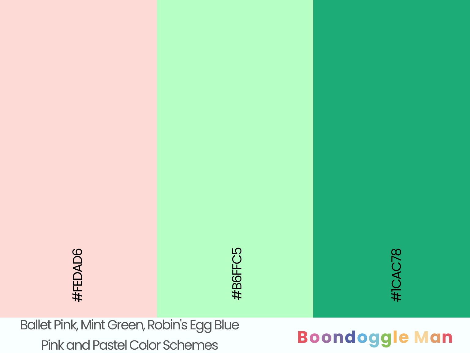
Hex Codes: #FEDAD6, #B6FFC5, #1CAC78
Sweet ballet pink enhanced by refreshing mint green accents and playful robin’s egg blue furniture makes for a lively, youthful interior.
43. Peach Pink, Periwinkle, Seafoam Green
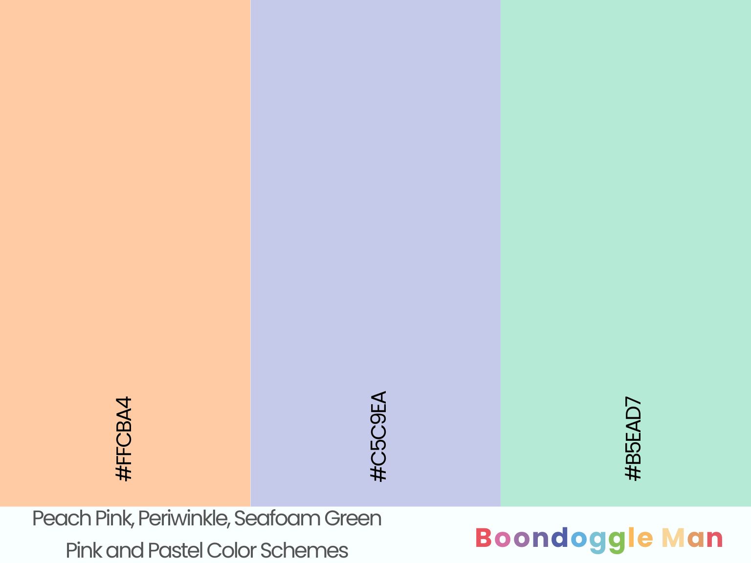
Hex Codes: #FFCBA4, #C5C9EA, #B5EAD7
Warm peach pink walls look bright and cheerful combined with pretty periwinkle accents and cool seafoam green upholstery. Perfect for spring.
44. Blush, Sky Blue, Butter Yellow
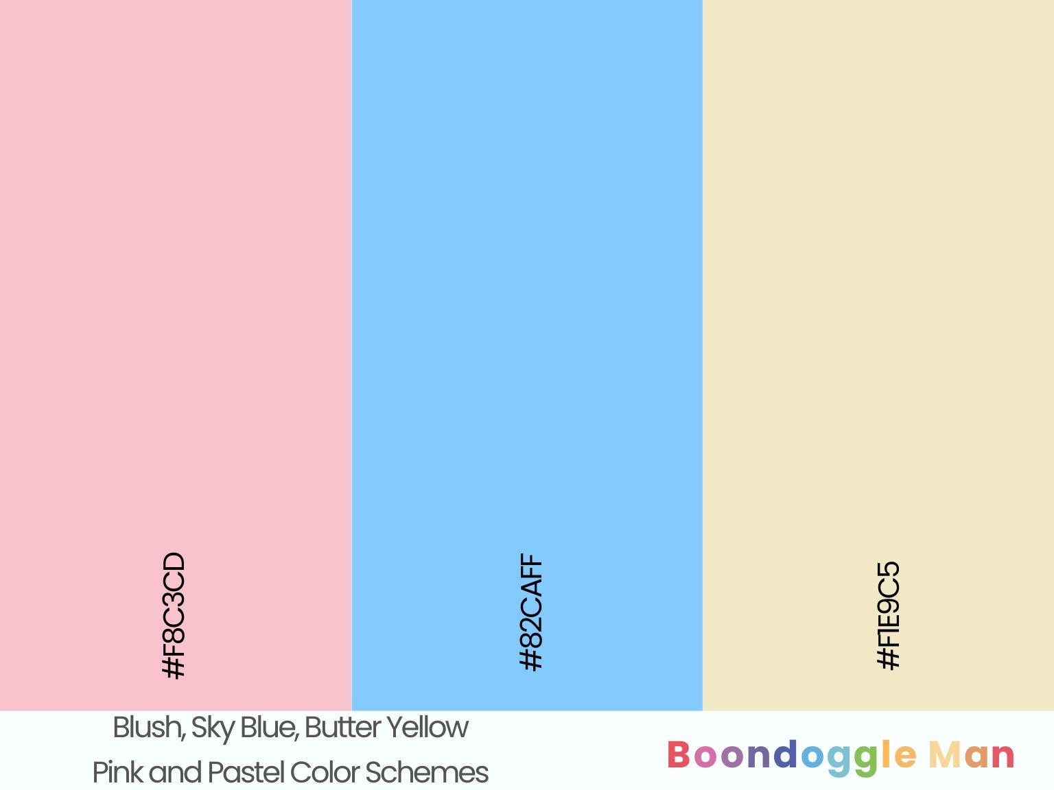
Hex Codes: #F8C3CD, #82CAFF, #F1E9C5
Romantic blush walls complement breezy sky blue furnishings and warm butter yellow accents beautifully. Ideal for shabby chic cottage bedrooms.
45. Fairy Pink, Lilac, Aqua Green
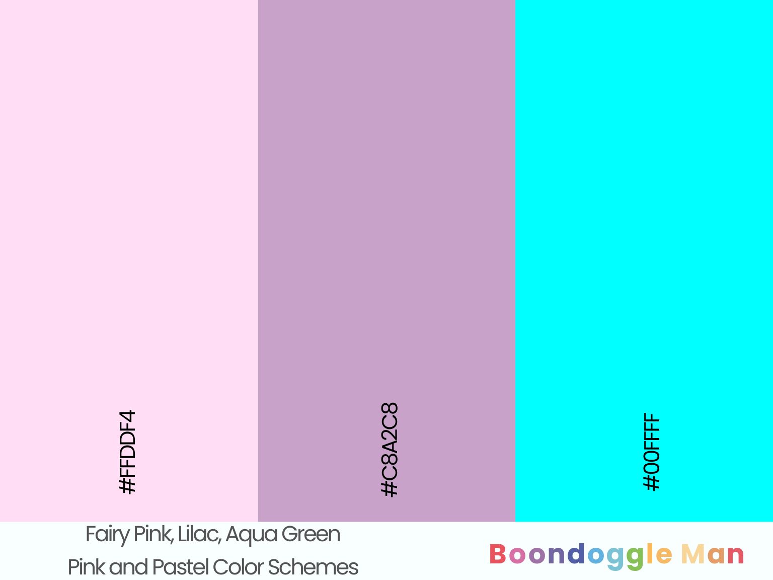
Hex Codes: #FFDDF4, #C8A2C8, #00FFFF
Fantastical fairy pink makes lilac and aqua green decor pop for an ethereal, dreamlike palette. Perfect for a whimsical child’s bedroom.
Design Tips for Decorating With Pink
Pink is playful, sweet and feminine. Follow these tips when incorporating pink into your home:
- Use soft pinks like blush as relaxing bedroom colors
- Add bright pinks as fun accents in a child’s room
- Pair pink with browns and neutrals for a calming look
- Combine pink and white for a romantic, bridal aesthetic
- Mix pink and gray for a stylish, sophisticated look
- Add pops of pink through accessories like throw pillows and rugs
- Incorporate pink alongside greens, blues and purples
- Use pink in bathrooms for a spa-like feel
- Add pink flowers like peonies for fresh, feminine flair
Frequently Asked Questions
What colors complement pink?
Whites, grays, browns, reds, greens, blues, and purples complement pink beautifully. Metallics like gold, silver, and rose gold also accent pink nicely.
What colors should be avoided with pink?
Don’t pair pink with extremely bright, loud colors like neon orange or lime green. Avoid combining pink with dull, muddy colors like olive or mustard yellow.
What colors make pink pop?
Contrasting colors like green, blue and purple make pink pop nicely. Black and white backgrounds also accent pink effectively.
What color furniture works with pink walls?
White, gray, wood tone, black or navy blue furniture look great against pink walls. Rose gold and brass accents also complement pink rooms.
What color bedding goes with pink?
White, gray, cream and light blue bedding coordinate well with pink walls. You can also use pink bedding in varying shades for a monochromatic look.
Final Takeaway
Pink is a versatile color that allows for many exciting color combinations ranging from soft to vibrant. Use these pink color palettes in your home, outfits and designs to create a playful, feminine look and feel.
bestiptvireland
Friday 8th of March 2024
Just wish to say your article is as surprising The clearness in your post is just cool and i could assume youre an expert on this subject Fine with your permission allow me to grab your RSS feed to keep updated with forthcoming post Thanks a million and please keep up the enjoyable work
temp mail
Tuesday 6th of February 2024
I wonder how much work goes into creating a website this excellent and educational. I've read a few really good things here, and it's definitely worth saving for future visits.
temp mail
Saturday 3rd of February 2024
Numerous of the content I've perused on this site are worth bookmarking for future reference. I am curious as to how much effort you put into developing such an exceptionally instructive website.
tvbrackets
Tuesday 30th of January 2024
I was recommended this website by my cousin I am not sure whether this post is written by him as nobody else know such detailed about my trouble You are amazing Thanks
puravive supplement review
Sunday 28th of January 2024
It was great seeing how much work you put into it. The picture is nice, and your writing style is stylish, but you seem to be worrying that you should be presenting the next article. I'll almost certainly be back to read more of your work if you take care of this hike.