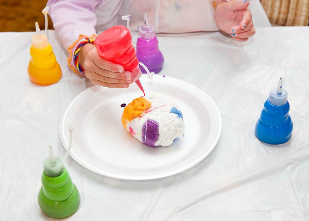
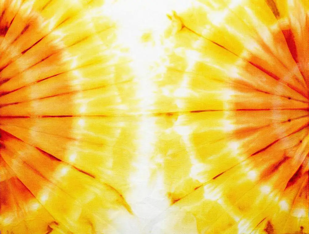
Tie dyeing is a fun craft that allows you to add bright, colorful designs to clothing, accessories and more. With so many color options, it can be tricky to know which combos work best together. This comprehensive guide covers the top tie dye color combinations to try for stunning results.
Table of Contents
Primary Color Combos
The primary colors – red, blue and yellow – are a classic trio to use in tie dye. They create high contrast and vibrancy.
Red, Blue and Yellow
This combo covers the entire color spectrum. For the best look, use a white or light base fabric. The colors will really pop against the neutral background.
| Pros | Cons |
|---|---|
| Bright, vibrant results | Can look messy if not applied neatly |
| Works well on light fabrics | Colors may bleed together |
Blue and Yellow
A lighter take on primary colors. This cool combo looks great on warm fabrics like orange, peach or tan.
| Pros | Cons |
|---|---|
| Softer look than red, blue, yellow | Less contrast than full primary combo |
| Goes well on warm toned fabrics | Blue may overpower yellow |
Red and Yellow
The warm version of the primary pairings. Use this on cooler toned fabrics like green, blue or lavender.
| Pros | Cons |
|---|---|
| Bright and energetic | Less versatility than full primary trio |
| Matches well with cool toned fabrics | Red may dominate yellow |
Secondary Color Combos
Secondary colors – purple, orange and green – also make eye-catching tie dye pairs.
Purple and Orange
This complementary duo offers lots of contrast. For best results, use a white or neutral base fabric.
| Pros | Cons |
|---|---|
| Striking color contrast | Can look messy if badly applied |
| Vibrant on light backgrounds | Colors may bleed together |
Green and Orange
A warmer take on secondary colors. Looks great on blue, purple or black fabrics.
| Pros | Cons |
|---|---|
| Cheerful color pairing | Less contrast than purple/orange |
| Matches well with cool toned fabrics | Can look muddy if colors bleed |
Green and Purple
A cool, mellow secondary combo. Use this on warm toned peach, yellow or red fabrics.
| Pros | Cons |
|---|---|
| Relaxing color scheme | Low contrast |
| Complements warm toned bases | Colors may bleed into each other |
Analogous Color Combos
Analogous colors sit next to each other on the color wheel, creating pleasant, subtle contrasts.
Red, Orange and Yellow
This warm trio looks cheery and summery. Use on cooler toned blue or green fabrics.
| Pros | Cons |
|---|---|
| Bright and fun color scheme | Low contrast |
| Matches well with cool toned bases | Colors may bleed together |
Blue, Green and Purple
A cool, soothing analogous scheme. Looks beautiful on warm peach, yellow or pink fabrics.
| Pros | Cons |
|---|---|
| Relaxing color palette | Less vibrant than complementary combos |
| Goes nicely with warm backgrounds | Low contrast |
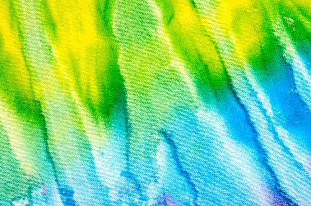
Yellow, Green and Blue
This combo offers a little more contrast than other analogous trios. Use on purple or red fabrics.
| Pros | Cons |
|---|---|
| Somewhat higher contrast | Less vibrant than primary/secondary pairings |
| Matches well with bold bases | Colors can bleed together |
Complementary Color Combos
Complementary colors (those opposite each other on the color wheel) provide the most contrast.
Red and Green
This Christmas combo packs a visual punch. Use on white or neutral fabrics for best results.
| Pros | Cons |
|---|---|
| Bold, eye catching contrast | Can look messy if poorly applied |
| Vibrant on light backgrounds | Colors may bleed together |
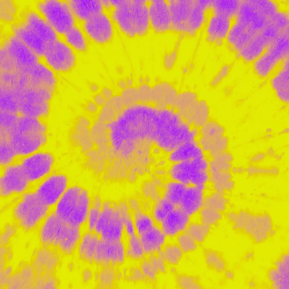
Purple and Yellow
Not as harsh as red/green, but still offers lots of contrast. Use on grey, black or white fabrics.
| Pros | Cons |
|---|---|
| Striking color contrast | Can appear messy if badly done |
| Vibrant on neutral bases | Colors may bleed into each other |
Blue and Orange
A bright, fun pairing. Use on neutral or dark fabrics for best effect.
| Pros | Cons |
|---|---|
| Strong visual contrast | Can look chaotic if poorly executed |
| Pops against dark/neutral bases | Colors may run together |
Split Complementary Combos
This scheme uses one color plus the two on either side of its complement. Provides less contrast than true complementary combos.
Red, Green-Blue and Yellow-Green
A toned down version of red and green. Use on white or light fabrics.
| Pros | Cons |
|---|---|
| Good contrast without being overpowering | Less vibrant than red/green combo |
| Works well on neutral bases | Colors may run together |
Purple, Yellow-Orange and Yellow-Green
A subtler take on purple and yellow. Looks great on grey or black fabrics.
| Pros | Cons |
|---|---|
| Nice contrast without being too bold | Not as striking as purple/yellow combo |
| Suits dark toned bases | Colors can bleed into each other |
Blue, Orange-Red and Orange-Yellow
A fun twist on blue and orange. Use on neutral or white fabrics.
| Pros | Cons |
|---|---|
| Good contrast without being overpowering | Less vibrant than blue/orange |
| Works well on light backgrounds | Colors may run together |
Triadic Color Combos
Triadic color schemes use three colors evenly spaced around the color wheel. This creates good contrast.
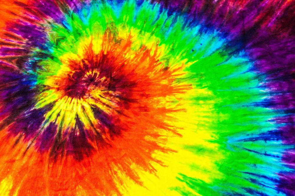
Red, Yellow and Blue
A high contrast triadic trio. Use on neutral or white fabrics.
| Pros | Cons |
|---|---|
| Bold, vibrant color contrast | Can look messy if poorly applied |
| Works well on light backgrounds | Colors may bleed together |
Purple, Orange and Green
A bright, exciting color scheme. Use on grey, black or white fabrics.
| Pros | Cons |
|---|---|
| Good color contrast | Can look chaotic if badly done |
| Vibrant on neutral bases | Colors may run together |
Blue, Yellow and Red-Purple
A slightly softer triadic scheme. Use on light or neutral toned fabrics.
| Pros | Cons |
|---|---|
| Nice color contrast without being too bold | Less vibrant than some triads |
| Works well on pale backgrounds | Colors may bleed into each other |
Tetradic/Quadratic Color Combos
Tetradic palettes use four colors spaced evenly around the wheel. This creates vibrant, diverse schemes.
Red, Yellow, Blue and Green
A high contrast tetrad. Best on white or light toned fabrics.
| Pros | Cons |
|---|---|
| Maximum color contrast | Can appear chaotic if poorly executed |
| Vibrant on pale backgrounds | Colors may bleed together |
Purple, Orange, Green and Yellow
A bright, lively combo. Use on grey or black fabrics.
| Pros | Cons |
|---|---|
| Vibrant color scheme | May look messy if badly applied |
| Pops against dark bases | Colors can run together |
Blue, Red-Purple, Orange and Yellow-Green
A slightly more subtle tetradic scheme. Looks great on light or white fabrics.
| Pros | Cons |
|---|---|
| Good color contrast without being too chaotic | Less vibrant than some tetrads |
| Works well on neutral backgrounds | Colors may bleed into each other |
Monochromatic Color Combos
Monochromatic palettes use shades, tones and tints of one color for subtle interest.
All Blues
Mix different shades of blue for cool, soothing results. Use on neutral or white fabrics.
| Pros | Cons |
|---|---|
| Calming, unified color scheme | Low contrast |
| Allows blue tones to shine | Can look muddy if poorly mixed |
All Greens
Different green shades create natural, earthy designs. Use on tan, cream or grey fabrics.
| Pros | Cons |
|---|---|
| Natural, soothing color palette | Very low contrast |
| Allows green hues to stand out | Can appear murky if not well blended |
All Purples
Mixing purple shades creates stylish, moody results. Use on black or white fabrics.
| Pros | Cons |
|---|---|
| Sophisticated color scheme | Very low contrast |
| Lets purple shades shine | Can look muddy if poorly executed |
Complementary Neutral Combos
Pairing bright colors with neutrals like black, white or grey creates clean, bold designs.
Red and White
This patriotic combo really makes the red pop. Use on darker clothing.
| Pros | Cons |
|---|---|
| Bold, striking color contrast | Staining risk with white |
| White makes red really stand out | High maintenance on white fabrics |
Blue and Black
Black makes the blue appear brighter and deeper. Use on lighter clothing.
Conclusion
Tie dyeing opens up an endless world of color combinations to create unique patterns and designs. When deciding on color schemes, keep in mind the color wheel and basic principles like complementary, analogous and triadic relationships.
The color combos covered in this guide highlight some of the best options for vivid, dramatic or subtle effects. Primary hues offer lots of contrast, while analogous tones are more understated. Complementary and split complementary pairs pack visual impact. Monochromatic shades provide cohesive, sophisticated results.
Don’t be afraid to think outside the box and mix colors in unexpected ways too. The joy of tie dye lies in the experimentation and ability to produce one-of-a-kind pieces. Keep safety in mind and avoid over-mixing muddy colors that may ruin the vibrancy. Work on white or pale garments first to let the dyes pop.
The possibilities are endless when it comes to tie dye! Try out some of the suggestions here, and use them as inspiration to come up with your own creative combos. Part of the fun is seeing the unique patterns and color blends that emerge after the big reveal. With a bit of practice, you’ll be designing colorful tie dye masterpieces in no time.